Kloti
Kloti: writing
What to post, and what to write on it. Carousels, captions and formats, for people who have to post about their own work.
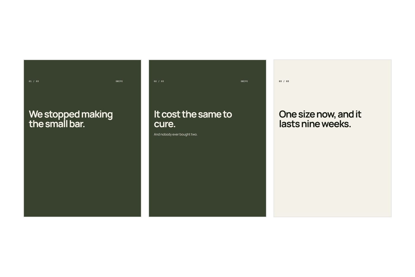
What to post when you have run out of ideas
Running out of ideas is almost never running out of material. Six places posts actually come from, and how to write a month of them in one sitting.
/7 min read
Read the post-

Carousels
What makes a carousel get saved and shared
Saves and shares are two different actions with two different causes, and a like is neither. What earns each one, and why slide two has to work alone.
/8 min read
-
Carousels
How to make a seamless Instagram carousel
One picture sliced across every slide. The arithmetic that makes it line up, the three things that break it, and why it changes what you can write.
/9 min read
-

Instagram
How to make a reel from photos, with no video
Motion in a reel comes from the cut, not from the footage. How to turn a folder of stills into something watchable, and how long each picture should hold.
/7 min read
-
Carousels
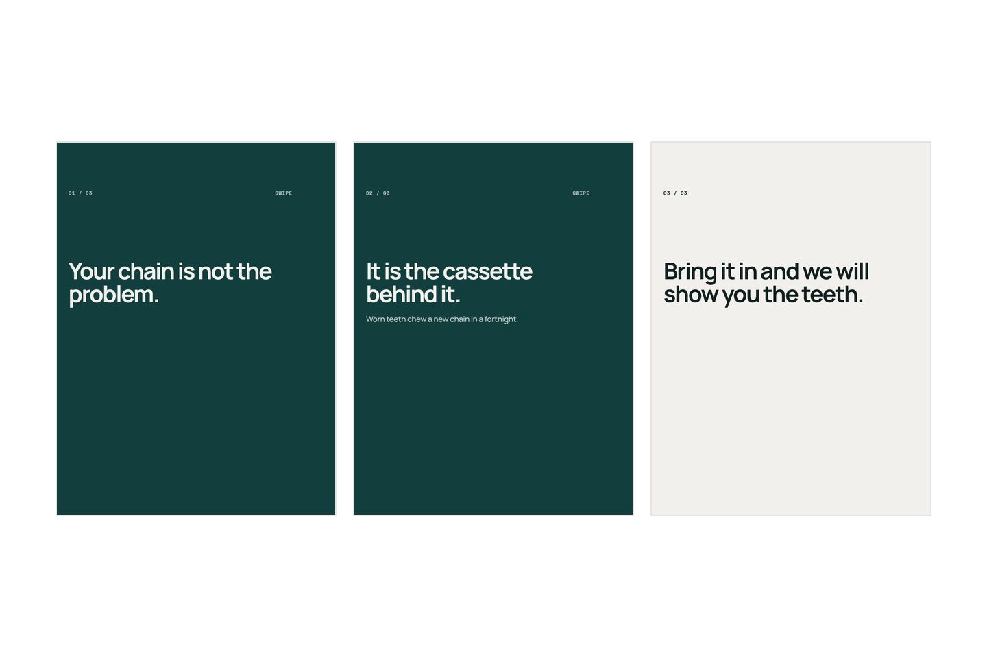
How to design a carousel when you are not a designer
Six decisions settle whether a slide reads, and each one can be checked rather than guessed. The rules, the arithmetic behind type size, and a five second test.
/10 min read
-
Instagram
How often to post on Instagram, and how to keep it up
No number is right for everybody. How to choose a cadence you can hold for a year, what to do in the week you cannot, and why a gap costs more than posting less.
/9 min read
-

Carousels
Why nobody swipes past your first slide
Carousels with almost no swipes have one thing in common, and it is not the design. What a first slide is for, and how to rewrite one that closed too early.
/5 min read
-

Carousels
What to write in a carousel caption
The caption is the half of the post most people leave until they are tired. What it is for, the four parts it needs, and why repeating your slides fails.
/6 min read
-
Carousels
What to post when you do not sell a product
Advice for social posts assumes you have something to photograph. If you fit kitchens, teach piano or treat backs, here is where the posts actually come from.
/6 min read
-
Carousels
How to make an Instagram carousel, start to finish
The four decisions a carousel is made of, in the order that saves the most work, and how to know you have finished writing before you open a design tool.
/6 min read
-
Carousels
What to post when you have nothing new to sell
Your last nine posts are the same product at a slightly different angle. That is not a photography problem, and one product holds far more posts than nine.
/7 min read
-
Carousels
What to put on a product carousel, slide by slide
A carousel is an argument, not a gallery. The shape that works, what belongs on each slide, and a test that tells you whether yours is saying anything.
/8 min read