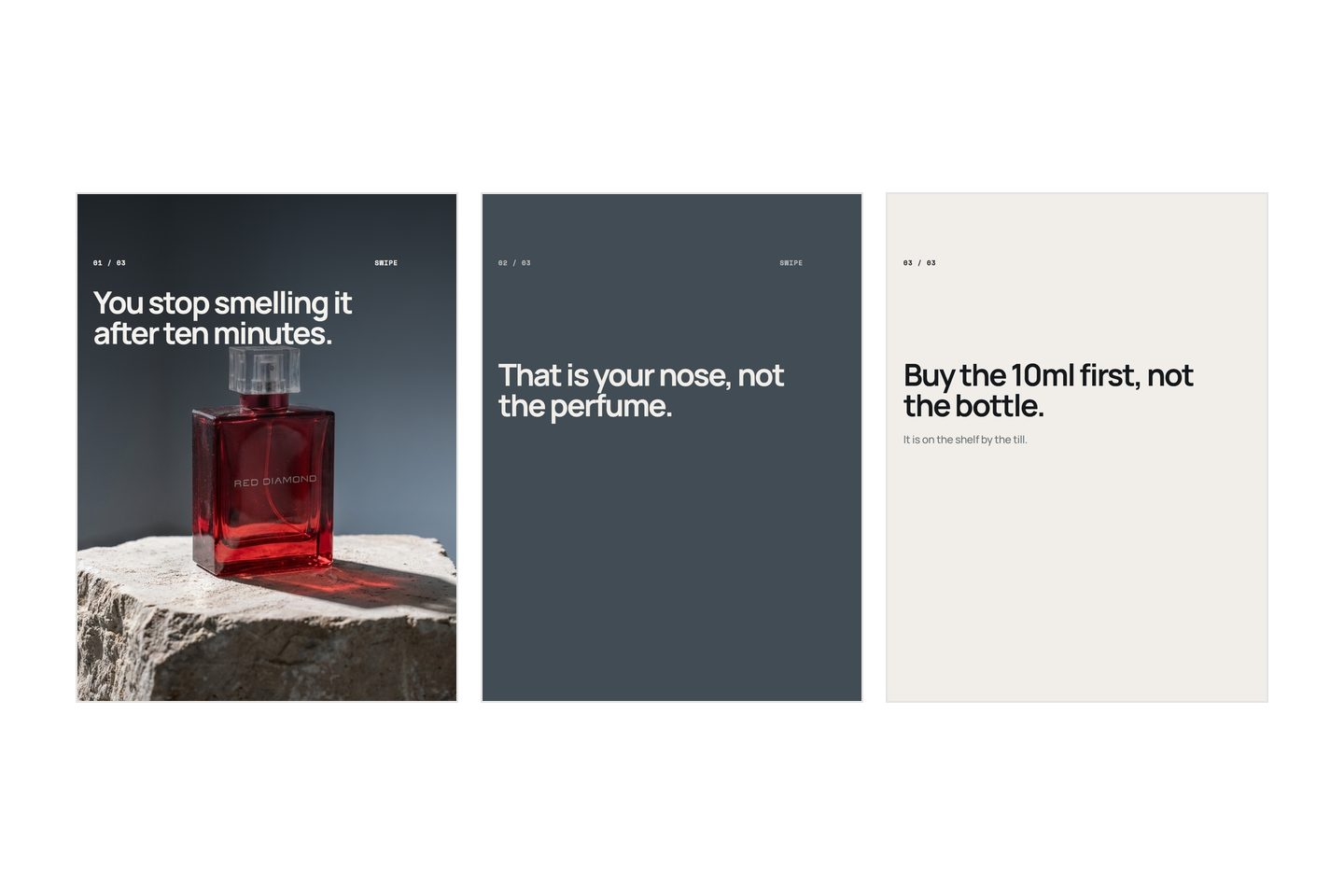
A seamless carousel is one wide image cut into equal slices, one per slide, so that swiping reads as panning across a single picture rather than turning pages. Five slides at 1080 pixels wide means one master 5400 pixels wide, cut at exact multiples of 1080. That is the entire technique, and the arithmetic is the easy half. The hard half is that it is fussier than a normal carousel, it changes what you are able to write, and for most posts it is the wrong choice.
Here is the arithmetic, the three ways it breaks, and how to tell whether it is worth an evening.
What a seamless carousel actually is
An ordinary carousel asks the eye to stop at each frame, read it, and decide whether to move on. Every slide is a small wall. A seamless one takes that wall away: a line, a horizon, a shape or a field of colour runs off the right edge of one slide and continues on the left edge of the next, and the eye follows a continuation without being asked. That pull sideways is the whole appeal. It does some of the work a reader would otherwise have to decide to do.
The version most people picture is a photograph. The version that works more often is a colour, a gradient, a stripe or a repeated pattern running across the set, with a photograph or two sitting on it as separate objects. That is far easier to build and it looks the same to a reader.
There is one fact the technique is usually sold without, and it changes how you should build one.
Nobody ever sees the whole picture. Not once, not in any view. A reader sees one frame, then a gap of thumb movement, then the next frame. A composition that only makes sense laid out flat is a composition nobody will experience, and it is an easy one to fall in love with while you are staring at the master on a laptop.
So build it the opposite way round to the tempting one. Check each frame alone, at the size it will ship, and look at the whole picture last, as a check rather than as the thing you are making.
The arithmetic
This is the part that usually gets waved at rather than written down, so here it is in full.
Fix the slide size first. Whatever you use for everything else. 1080 wide by 1440 tall is a portrait shape a feed accepts; 1080 by 1350 and 1080 by 1080 behave identically for this purpose. The height never enters the arithmetic. Only the width does.
Multiply the width by the number of slides. That is your master.
| Slides | Master at 1080 x 1440 | Its ratio |
|---|---|---|
| 3 | 3240 x 1440 | 2.25 to 1 |
| 5 | 5400 x 1440 | 3.75 to 1 |
| 8 | 8640 x 1440 | 6 to 1 |
| 10 | 10800 x 1440 | 7.5 to 1 |
Cut at exact multiples. Slide one is 0 to 1080, slide two is 1080 to 2160, slide three is 2160 to 3240, and so on to the end. Exact integers, not roughly. A slice that is 1081 wide, or that starts one pixel early, either repeats a column of pixels or drops one at the join, and both read as a small stutter that a person notices without being able to say what they noticed.
Scale both numbers together if you want more resolution. A five slide post can be built at 10800 by 2880 and each slice exported down to 1080 by 1440. What you must not do is scale one dimension and not the other.
Now look at the right hand column, because that is where most seamless carousels die before they start. A five slide master is nearly four times wider than it is tall. A photograph out of a phone is about one and a half times wider than it is tall. You are not cropping one into the other, and stretching is visible immediately. Either the picture was shot as a panorama on purpose, or it is extended with plain ground on both sides, or the wide image is not a photograph at all. That last option is why the colour-and-pattern version is the one to build first.
So build the master at the multiple rather than making an existing picture fit one. Start a canvas at 5400 by 1440, put things on it, then cut. Start instead from a picture that happens to be 4000 pixels wide and your slide width is 800, which every slide then has to be, and which the feed will scale back up on the way in and soften. Divide, never stretch, and prefer not to be dividing at all.
What breaks it
A crop you did not choose
Feeds tend to apply the first slide's shape to the whole set, so one slice at a different height or width takes the entire post with it. This is the failure that survives every visual check, because each slide looks perfectly correct on its own and the fault only exists between them. Export every slice from one operation, at one size, and read the file properties of all of them before you upload.
Two other habits will break a joint that was otherwise fine: adding a border, a rounded corner, a watermark or a frame to each slide, and saving each slice separately through a lossy compressor, which can leave a faint edge difference down the middle of a flat gradient. Export once, from one master.
The ratio drifting
Every slide identical, to the pixel. Never a square slide in a portrait set, not even the last one, not even if it looks fine in the upload screen. Dimensions are the one part of a carousel with no artistic latitude, and this is the format where getting them wrong is not a compromise but a broken post.
Text landing on a seam
A word split across two slides is never read as one word, because the two halves are never on screen at the same time. This is where the printed comparison misleads people: a magazine spread lets a headline cross the gutter because you can see both pages at once. A carousel never shows you two slides together, so a crossed word is simply two broken fragments in sequence.
So type sits wholly inside one frame, with margin, and the margin has to clear the outer strip of every slide, because that strip carries interface on some surfaces and gets cropped on others.
The practical move is to draw the seam lines onto your master before you place a single word, and treat a band either side of each one as unusable. A hundred pixels each way is a reasonable start. Then put nothing you need read near a seam even where it technically fits, because the seam is where the reader's attention resets, and a line landing there gets read at the worst moment it could.
What it does to the writing
This is the part most guides skip, and it is a bigger consequence than any of the mechanics above.
A normal carousel gives every slide its own headline. One claim per frame, each complete, each a small stop, which is exactly the structure that makes a sequence readable. That structure is fighting a continuous picture. A self-contained line says stop and read this; the running image says keep going. Do both at once and the post feels busy in a way nobody can name.
So a seamless carousel wants fewer words, in fewer places. One sentence spread across the whole run rather than one per slide. Or words on three of eight slides and nothing at all on the other five. The empty frames are not waste: they are the reason anybody can see the joins.
Where the words go is decided by the picture rather than by a grid. Find the quiet parts, the flat sky, the plain wall, the empty half of a colour field, and put the type there. So the type will not sit in the same place on every slide, which is the opposite of the discipline you would use anywhere else, and here it is correct.
The thing you give up is larger than it sounds. A stepped argument needs visually separate frames. Slide three cannot contradict slide two if it is visibly the same picture as slide two, because the eye has already read them as one continuous object and the turn gets lost inside it. A seamless carousel is good at one idea unfolding, at a mood, and at a reveal. It is bad at a list, bad at a comparison, and bad at anything with a "but" in it.
Which means the format decision comes after the writing, not before. Write the sentences in a list first, as the start to finish process has you do anyway, then read them. If each line answers the one before it and the order carries the meaning, the joins are the meaning, and a picture that hides the joins will hide the argument too.
When not to make one
- A list of nine things. Nine independent points want nine independent frames. Continuity works against a list, because it tells the eye that the nine are one thing.
- Anything you want saved. A slide that gets filed has to survive being looked at on its own, weeks later, and a slice of a picture is half of something by construction. That trade is set out in what gets saved and sent.
- Anything you will want to edit. One typo means re-slicing the whole set and re-uploading the post, which loses whatever it had already gathered.
- When you have one photograph and it is an ordinary shape. Cropping it wider does not make it wider. This is arithmetic, not effort.
- When it has to work as a grid tile or a reshare. Your profile shows slide one, cropped, on its own. If your first slice is an empty run-up into the picture, your grid tile is a blank rectangle.
- Your first three carousels. Said plainly because it saves the most time: a normal carousel with better sentences beats a seamless one with worse sentences every single time, and the sentences are the part almost everybody is short of.
What differs by platform
The mechanic travels anywhere that shows a fixed set of images in a fixed order at a fixed size. Divide, cut, upload in order. What changes is whether the order survives, and that is the difference to check first. Everywhere else the order is a preference, and a post shown out of sequence merely reads oddly. Here it is load bearing, and any surface that shuffles, reorders or shows a subset of your images destroys the post completely without warning you.
One Instagram behaviour is worth knowing about here specifically. If somebody sees a carousel and does not swipe, the platform will often show them the second image instead, which is what Adam Mosseri said about carousels in October 2024, reported by Social Media Today. On a normal carousel a strong second slide covers that. On a seamless one, slide two is the middle of a picture, and arriving there cold with no left hand edge is genuinely confusing. Give slide two something that reads on its own.
The covering problem also applies with a twist. Where an app lays its caption and buttons over the bottom of a frame rather than beside it, a line crossing a seam low in the picture is hidden in one view and visible in another, so the joint appears and disappears depending on where somebody sees it. Keep the part of the composition that does the joining in the middle band.
If you want to try one, make the smallest possible version: three slides, a flat colour or a soft gradient running across all three, one sentence, nothing within a hundred pixels of either seam. Three slides at 1080 is a 3240 pixel master and about twenty minutes of work, and you will learn more from it than from reading another guide. We build Kloti, which writes and lays out carousels, and it makes the ordinary kind rather than this one, on the grounds that the words are what most posts are short of and a joined picture does not supply them.
Written by the Kloti team. Kloti writes and designs a carousel about your work, and the caption to post it with. The pictures on this page were generated in Kloti.