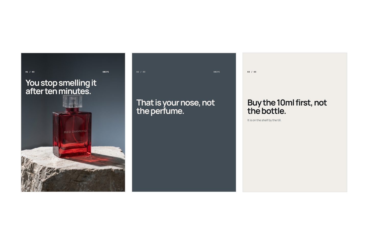
A carousel needs one slide that makes somebody stop, as many as the argument actually takes, and one that asks for a specific thing. The number is decided by what you have to say, not chosen in advance. Most Instagram carousels for a product are the same item photographed six times with the brand name on top, which is a catalogue, and nobody browses a catalogue they did not ask for.
That is the answer. What follows is what each slide is for, how to know when you have run out of things to say, and a test for a carousel you have already posted.
What makes a carousel hard
Every other picture you make is judged on its own. A carousel is judged as a sequence, and the sequence has a gate at the front: if nobody swipes past slide one, the other slides did not happen.
Carousels are widely believed to reach further than a single image. Whether or not that holds for your account, the format has an advantage that needs no algorithm: somebody who swipes has chosen to give you another second.
The gate changes what slide one is for. A single image has to carry everything, so people put the brand name on it and stop. Slide one has one job instead, and it is not summarising: it is making slide two worth reaching. "Autumn collection now in" has closed the subject, and there is nothing left the reader needs. That failure has its own post, because it is the one that costs the most: why nobody swipes past your first slide.
The second difficulty is speed. Plan a carousel as though each slide gets about the length of a thumb movement, because that is the pessimistic case and the pessimistic case is the one you can design against. One idea per slide is not a matter of taste, it is what fits in the time you get.
The slides a carousel needs
Five slides is a common shape and a fine place to start. It is not a rule, and the number is the wrong thing to decide first.
What matters is that every slide earns its place by saying something the one before it did not. Five slides that each make a point beat five that circle one. And a set of ten holds somebody perfectly well when it is going somewhere: a countdown, a range with prices, a before and an after in six steps. The reader does not stop because there were too many slides. They stop because a slide told them nothing new, and once that has happened twice they are gone whether there are three left or nine.
So write until the argument is finished, then cut the slides that repeat.
| Slide | Its one job | The version that fails |
|---|---|---|
| 1 | Make slide two worth reaching | The logo over a packshot |
| 2 | Your strongest single point, stated | A second angle of the same product |
| 3 | The point that answers the obvious doubt | An adjective |
| 4 | Proof: the detail that earns belief | Another adjective |
| 5 | One specific thing to do | "Link in bio" |
Put your strongest middle point on slide two rather than saving it for the end. Assume fewer people reach slide four than slide two, and build the order for the person who leaves early.
The last slide is where most sellers give up. "Link in bio" asks for navigation, not a decision, and it leaves the reader doing the remembering: which product was it, what was it called, where in the shop. Name the thing and say where it sits. "The 200g is the one to start with, second row in the shop." "Reply with the word restock and we will message you when it lands." If you cannot write that sentence, you had not decided what the carousel was for.
What goes on each slide
Eight words, then stop
Count the words on your busiest slide. Over about eight and it stops being read and starts being looked at, and the shape of a paragraph is itself a reason to swipe. Eight is not a measured limit, it is a working ceiling that keeps the type big enough to survive at the size the app shows it.
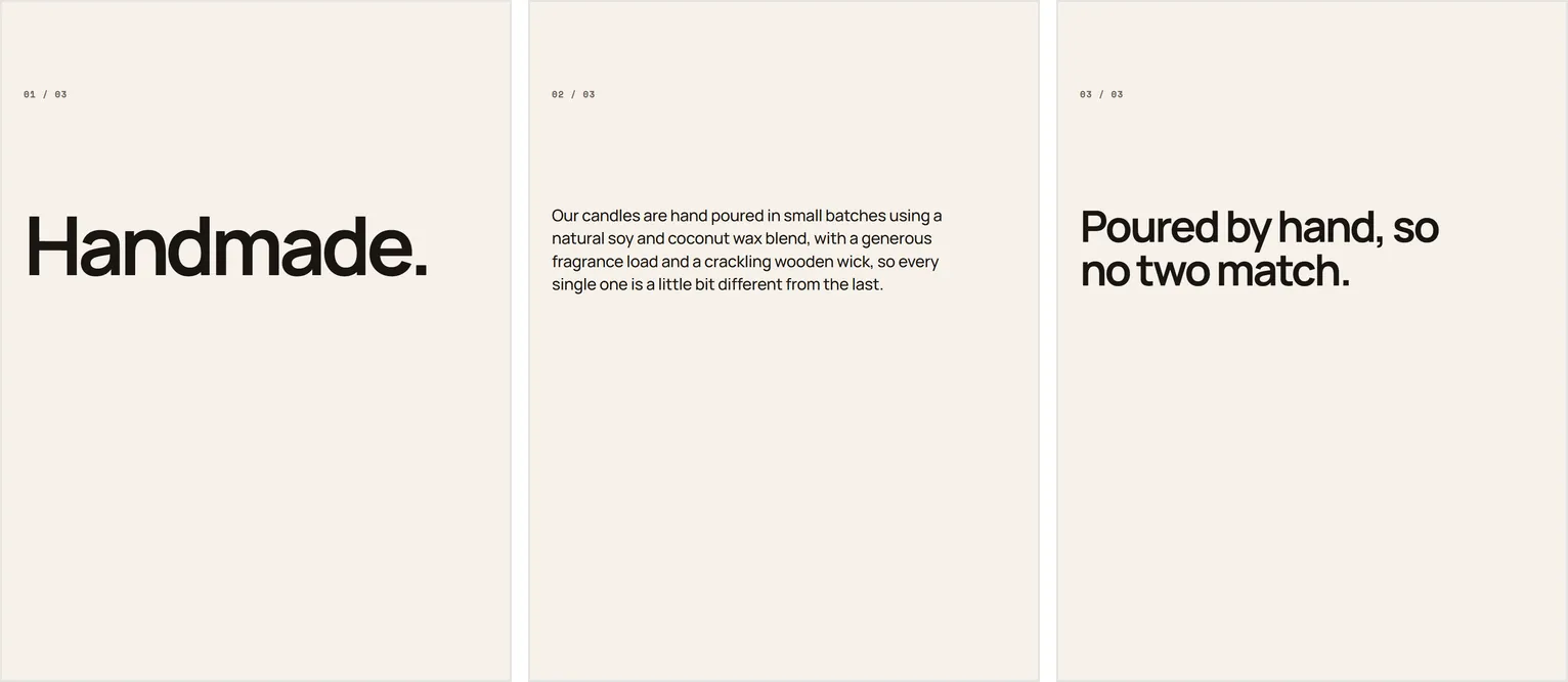
Write the one idea as a sentence, not a label. "Handmade" is a label and does no work. "Poured by hand, so no two match" is a sentence, it is seven words, and a reader can do something with it.
Where the words can go
The middle of the frame is yours. The edges are not, and the reason is mechanical rather than aesthetic. The slide gets cropped in your profile grid, gets a caption or a counter laid over it in some views, and gets cropped again when somebody reshares it. Keep the outer tenth of every edge empty.
Contrast has to survive a cheap screen in daylight: dark type on a light ground, or light type on a dark ground, on the flattest part of the picture. If the picture is busy everywhere, do not fight it. Put a solid band behind the type, or move those words onto a slide of their own. Then check the slide at the size a feed shows it, on a phone.
Type over a photograph is a compromise even when it works, so keep the words off the picture wherever the slide will let you.
Which slides need a photograph
This is the counterintuitive part: not all of them, and probably not most of them. Five product photographs in a row read as a catalogue, and a catalogue answers the question "which one", which nobody scrolling a feed has asked yet. They have not asked anything. The argument has to happen first.
So: slide one is a photograph, almost always, of the product or of the situation it is for. The middle slides that carry an idea are usually better as words on a plain ground: a flat colour from your packaging, a plain surface, a close crop of a material with nothing happening in it. A plain slide reads as a statement, because the eye has nothing to do except read.
One middle slide should be a photograph that proves the claim, because proof is the one thing a plain slide cannot give you. The hand holding it for scale. The stitching. The wax pool. Then the last slide goes plain again, so the instruction gets read.
Picture, words, picture, words, instruction. The alternation makes the swipe feel like it is going somewhere, and every second slide is type on a colour. You still need two or three genuinely different photographs, which is its own problem when there is one thing to photograph and five slides to fill.
Carousel mistakes
The big one, and it is nearly universal: every slide says the same thing in a different font.
Here is the test. Cover the pictures. Read only the words, in order, out loud. One of two things comes back.
Handmade. Small batch. Natural ingredients. Made with love. Shop now.
Or:
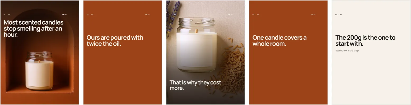
Most scented candles stop smelling after an hour. Ours are poured with twice the oil. That is why they cost more. One candle covers a whole room. The 200g is the one to start with.
The first can be read in any order and nothing changes, because it is a list of adjectives. The second cannot: move the third line and it stops making sense. Order dependence is the test. Slides that shuffle without damage are not a sequence.
Three other failures worth naming:
- The brand name on every slide. It is already at the top of the post and on your profile. Giving it the largest type on slide one spends your only swipe on information the reader has.
- Slides added because twenty are allowed. Length is not the fault, repetition is: a slide that restates the one before it teaches the reader that swiping is not worth it, and they apply that lesson to everything after it.
- Adjectives where a statement belongs. "Premium quality" gives a reader nothing to check. If you cannot get from the adjective to a fact, the problem sits upstream of the carousel, in how the thing is described at all.
What differs by platform
Instagram allows up to twenty photos and videos in a single feed post, per the Instagram Help Center (checked August 2026). An allowance is not a target.
Two things to plan around. First, shape: make every slide identical in dimensions before you upload, because feeds tend to apply the first slide's crop to the rest, and a square slide in a portrait set loses its edges. Tall portrait takes more of a feed than square does.
Second, interface: some apps lay their own buttons and caption over the picture rather than beside it. On those, the right edge and the bottom third are not yours. Look at one of your own posts inside the feed on a phone before you decide where the type sits. The upload screen never shows you what a stranger sees.
On your own product page the catalogue is right, because the argument already happened there. These rules are for the feed, where nobody arrived on purpose.
Plan it on paper first. Five boxes, one sentence in each, then decide which boxes need a photograph. If you cannot fill five boxes with five different sentences, make a four slide carousel. One that argues something beats a nine slide one that repeats itself. The start to finish process puts that planning step in order, and what to write in a carousel caption covers the half of the post that sits underneath it.
Written by the Kloti team. Kloti writes and designs a carousel about your work, and the caption to post it with. The pictures on this page were generated in Kloti.