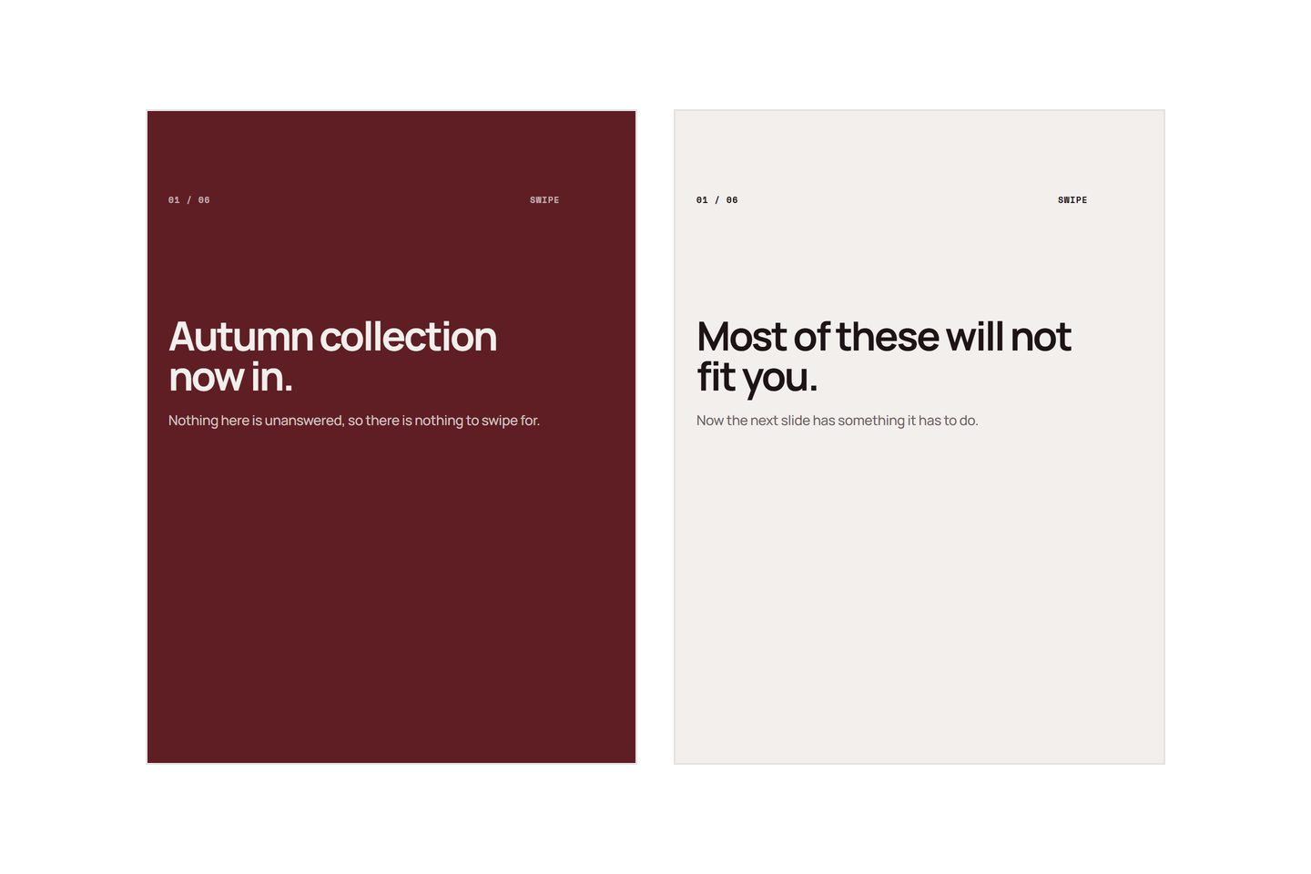
Almost always, the first slide answered its own question. "Autumn collection now in" is complete on arrival: the reader has the information, nothing is unresolved, and swiping would only get them more of something they have already decided about. A first slide is not a summary. Its only job is to make the second slide worth reaching, and a slide that closes its subject has quietly done the opposite.
Here is how to tell whether that is what happened, and what to do instead.
The artifact
You post a carousel. The first slide gets seen. Then the numbers fall off a cliff: the swipe count is a small fraction of the views, and the later slides barely register at all.
The tempting reading is that the algorithm buried it, or that carousels do not work for your kind of business. Both are possible. But before either, check the shape of the drop. A carousel that people started and abandoned in the middle has a different problem from one nobody entered at all, and the fix is different too.
If the drop happens between slide one and slide two, this post is about your problem. If it happens around slide four, you have a repetition problem further down and the slide by slide breakdown is the better read.
What looks wrong
Look at the first slide and the usual suspects present themselves. The photograph is not good enough. The type is too small. The colours are flat. The logo should be bigger, or smaller, or somewhere else.
So people redesign. New template, better crop, a font with more personality. Sometimes the numbers move slightly, because a clearer slide is genuinely easier to read, and that small improvement is misleading: it confirms that design was the problem and sends you back to design for the next one.
The other apparent explanation is reach. If fewer people saw it, fewer people swiped. That is true and it is not the same measurement. Swipes as a share of the people who did see it is the number that tells you about the slide, and it is the one that stays low no matter how many times the template changes.
What is actually wrong
The slide is a sign, not an opening.
A sign states a fact and finishes. "Autumn collection now in." "Handmade candles." "20% off this weekend." Read one and you know everything it has to offer. There is no gap left in the reader's head, and a swipe is what closing a gap feels like.
An opening leaves something unresolved that the reader now wants settled. "Most of these will not fit you." "Your chain is not the problem." "We stopped making the small bar." Each of those is incomplete on purpose. The reader has a question, and the only place to get it answered is slide two.
This is not a trick and it is not clickbait, which is the objection worth taking seriously. Clickbait leaves a gap it does not fill, or fills it with something trivial. An honest opening states something true and specific that genuinely needs the rest of the post to explain. The test is whether slide two actually answers it. If it does, you have written a sequence. If it does not, you have written a headline and then changed the subject, and readers punish that harder than a boring first slide.
Three shapes of sign, and what each one is usually hiding:
| The sign | What it says | What was true underneath |
|---|---|---|
| The announcement | "New range now in" | Something specific about the range that would have been interesting |
| The label | "Handmade" | The reason it is handmade, and what that costs you |
| The offer | "20% off" | Who it is for, and why now rather than any other week |
In each case the honest sentence was more specific and would have made a better opening. The sign is what you write when you have not decided what the post is about, which is a writing problem wearing a design problem's clothes.
The fix
Take your first slide and ask one question of it: after reading this, does the reader need anything?
If the answer is no, you have a sign. Rewrite it using whichever of these gets you a true sentence fastest.
Move the most surprising thing forward. Somewhere in your carousel, probably slide three or four, is the fact you found interesting enough to make the post about. Most people bury it, because it feels like it needs setting up. It does not. Put it first and let slides two and three do the explaining, which is what they were going to do anyway.
Name the reader's wrong assumption. "Your chain is not the problem" works because the reader arrived believing the opposite. This one is available to almost every trade and service, because expertise is largely a list of things customers get wrong.
Say the thing you would say out loud. If somebody asked about this in person, your first sentence would not be "autumn collection now in". It would be something like "most people buy a size too big in these". Write that.
Take the brand name off it. It is already at the top of the post and on your profile. Giving it the largest type on slide one spends your only swipe on information the reader already has.
Then check the join. Read slide one and slide two together, out loud, in order. If two does not answer one, one of them is in the wrong place. Do that for every pair, and the carousel starts holding people past the middle as well, which is the same fix applied further down.
Write the words before you design anything, because a first slide is a sentence problem and a design tool will not tell you that. The start to finish process puts that step first for exactly this reason.
What is still broken
A good first slide cannot rescue a post with nothing to say. If the carousel underneath is five slides of adjectives, the opening will get people in and the middle will lose them, and you will have moved the drop-off rather than removed it.
Reach is still not something you control from the slide. A better opening improves the share of viewers who swipe. Whether more people see it in the first place depends on things no sentence fixes, and anybody promising otherwise is selling something.
And the numbers are noisy at small scale. If you post to a few hundred people, one post's swipe rate tells you very little. Change the opening on the next four posts, not the next one, and compare the group. Two of those four will do worse for reasons that have nothing to do with the change.
Some carousels also fail for a much simpler reason: the first slide was cropped and the words came off. That is a sizing fault rather than a writing one, so check the shape and the margins before rewriting anything.
Written by the Kloti team. Kloti writes and designs a carousel about your work, and the caption to post it with. The pictures on this page were generated in Kloti.