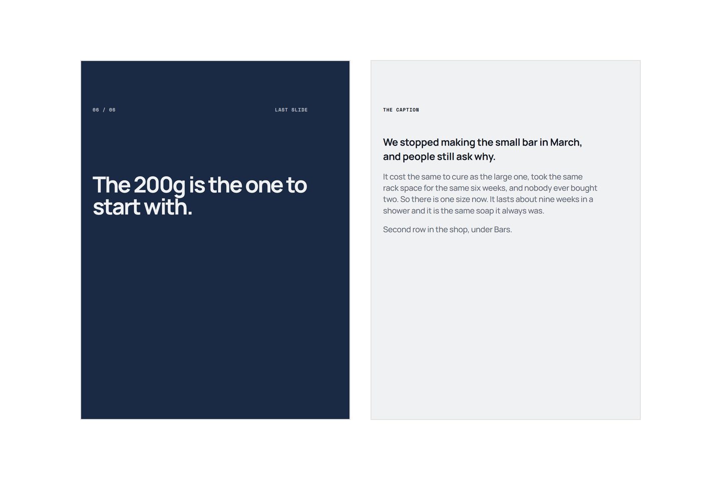
Write the thing the slides could not fit. A caption is not a summary of the carousel and it is not a place for the same claim in longer form: the reader has just been through the argument, so repeating it is the fastest way to lose them. Use it for the detail, the caveat, the story behind the decision, and the one specific instruction you want followed. Then put the instruction where somebody who read two lines will still see it.
That is the job. Here is how the parts fit together.
What makes a caption hard
Two things, and neither is writing ability.
The first is that most of it is hidden. A feed shows the opening line or two and then a "more" link, and most people never tap it. So a caption is really two pieces of writing at once: a short one that has to work alone, and a long one for the minority who opened it. Writing a single flowing paragraph and hoping serves neither.
The second is timing. The caption gets written last, after the slides are made, when the work feels finished. That is why so many are a hashtag pile with a sentence on top. The words that took effort went on the slides, and the box underneath got whatever was left.
There is a third thing that is not a difficulty so much as a missed opportunity. The caption is the only part of the post with no size limit worth worrying about and no design constraints at all. Eight words is a working ceiling on a slide, because type has to survive being read at the size a phone shows it. The caption has no such ceiling. It is the one place you can be specific at length, and it is routinely the least used space in the whole post.
The parts a caption needs
Four, and the order is close to fixed because of the truncation.
| Part | Its job | Length |
|---|---|---|
| The opening line | Work alone, before anyone taps "more" | One sentence, and it must not repeat slide one |
| The middle | The detail, the caveat, the story the slides had no room for | As long as it earns |
| The ask | One specific thing to do, named | One sentence |
| The tags | Be findable | Last, and out of the way |
The ask sits third rather than last on purpose. Put it after the tags and it is below a wall of blue text that most readers skim past. Put it before them and it is the last thing anybody reads as a sentence.
Not every caption needs all four. A post that is purely a story can end on the story. But if you want something to happen, the ask is not optional and it is not "link in bio".
What goes in each part
The opening line
This is the caption's own first slide, and it has the same job: make the next thing worth reading. It must not repeat slide one, because the reader has just read slide one, and seeing it again in smaller type is the clearest possible signal that nothing new is coming.
The reliable move is to open on the part of the story the slides had no room for. If the carousel argued that your soap costs more because of the oil, the caption can open on the week you tried it the cheap way. If the carousel explained why a chain keeps wearing out, the caption can open on the customer who came back three times before anybody checked the cassette.
Keep it to one sentence and put nothing important after it that a truncated reader needs.
The middle
This is where the caption earns its space, and the useful rule is that it should contain at least one thing you would not put on a slide.
Good material: the reason behind a decision, the thing that went wrong first, the limit or the caveat, who this is not for, what it costs you to do it this way, the specific numbers a slide would have made unreadable. A caveat in particular does more for belief than any adjective, because it is the one thing a seller has no incentive to invent.
Write it in short paragraphs with blank lines between them. A caption is read on a phone in a column about forty characters wide, and an unbroken block is a grey shape people skip. This is also where a plain description of what you actually do pays off: captions get easier when you have already written the specifics down once.
The ask, then the tags
Name the thing and say where it sits. "The 200g is the one to start with, second row in the shop." "Reply with the word restock and we will message you when it lands." "Ask for the hip screen, not the back one."
Each of those is a decision the reader can act on without remembering anything. "Link in bio" asks them to navigate, then find, then choose, and every step loses people. If you cannot write the specific sentence, you had not decided what the post was for, which is a problem that started well before the caption.
The tags go after it. Use the ones that describe what the thing actually is rather than the ones with the largest counts, because a tag with millions of posts is a room you are invisible in. Keep the number modest and stop treating them as the caption's main event.
Caption mistakes
- Summarising the slides. The most common one by a distance. The reader has just swiped through the argument; the caption restating it teaches them that the caption is never worth opening, and they apply that to your next post too.
- Burying the ask under the tags. It gets read as part of the tag block and skipped with it.
- Opening with the ask. "Shop now, link in bio" as line one spends the only guaranteed real estate on an instruction to somebody who has not been given a reason yet.
- One unbroken block. No line breaks, read on a phone, in a narrow column. It is not a writing problem, it is a shape problem, and it costs you the middle.
- Emoji as structure. A bullet made of an emoji is fine occasionally and unreadable in bulk, and screen readers announce every one of them by name.
- Writing it while tired. Write the caption while you are writing the slides, in the same sitting, from the same list of sentences. The material is all in your head at that moment and it will not be an hour later.
The last one is worth more than the other five combined. If you write the slides as a list of sentences first, which the start to finish process recommends anyway, the lines you cut from the slides are your caption. They were too long or too specific for a frame, and that is exactly what the caption wants.
What differs by platform
The mechanics differ more than the writing does.
How much shows before the truncation varies by app, by surface and by whether the reader is on a phone or a browser. Do not count characters. Write an opening sentence that works alone and assume everything after it is optional, and the caption survives wherever it is shown.
Some surfaces make links in a caption clickable and some do not, which is why a written instruction beats a pasted URL: an instruction works in both cases and a dead link looks careless.
Placement differs too. On a feed the caption sits under the post and can be long. On a profile grid it does not appear at all, which is a reason the first slide has to carry the post on its own there, and why nobody swiping past slide one is a separate problem from a weak caption.
One habit closes most of this out. Post it, then read your own caption in the feed on a phone, without tapping "more". Whatever you can see is the caption most people will ever read. If that is not enough on its own, move something up.
Written by the Kloti team. Kloti writes and designs a carousel about your work, and the caption to post it with. The pictures on this page were generated in Kloti.