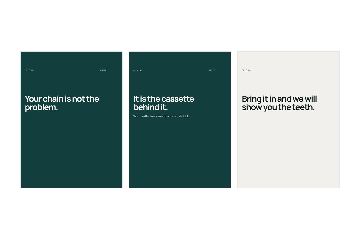
Decide the one thing it says. Write one sentence per slide until that thing is fully said. Then choose which of those sentences would be better as a picture. Design last, and only then. Most people do this in reverse, opening a template first and looking for words to fill it, which is why so many carousels are six slides that all say the same thing in a different font.
That is the order. Below is what each step actually involves, and where people get stuck.
What makes a carousel hard to start
The blank template is the problem, and it is a specific problem rather than a general one.
A template asks you how many slides you want before you know what you are saying. It shows you six frames, so you fill six frames. The sixth exists because the template had six, not because you had a sixth thing to say, and a reader can tell the difference immediately: the slide that repeats the one before it is the slide they stop on.
The second difficulty is that a carousel is judged as a sequence and made as a set of separate pictures. Every tool you might use encourages you to perfect slide one, then slide two. But the reader experiences the joins, not the slides, and the joins are the part nobody edits.
So the fix is procedural rather than creative. Write the whole thing as sentences, in one place, before anything is designed. A list of sentences is easy to reorder, easy to cut, and impossible to hide behind a nice layout.
The decisions a carousel needs
Four, in this order. The order matters because each one closes off work in the ones after it.
| Decision | The question | What it costs to get wrong |
|---|---|---|
| 1. The one thing | What does somebody know after this that they did not before? | Everything downstream. A carousel with no answer here cannot be rescued by design |
| 2. The sentences | What is each slide's single claim? | You design slides you later delete |
| 3. The pictures | Which of these sentences is better shown than said? | You shoot or make images you do not use |
| 4. The layout | Where do the words sit, at what size? | Only this slide, which is why it goes last |
Decision one is a single sentence and it is not the title. "Why our candles cost more" is a subject. "Ours are poured with twice the oil, which is why they cost more and why they last" is the one thing. If you cannot write it, the carousel is not ready and no amount of slide-making will make it ready.
Decision two is where the post is actually written, and it is the step people skip.
What goes into each decision
Write the sentences in a list, not on slides
Open anything that makes a plain list. Write one line per slide. Do not number them yet, do not write a headline and a body, just the claim.
Then read the list in order, out loud. Two things happen. Lines that repeat each other become obvious, because you hear yourself saying the same thing twice. And the order fixes itself, because a list read aloud has an audible point where it stops making sense.
Now apply one test: shuffle the lines. If the carousel still reads, it is not a sequence, it is a set of adjectives, and adjectives can be read in any order because none of them depends on the one before. That is the single most useful check in this whole process, and the slide by slide breakdown goes through what each position in a good sequence is for.
Stop writing when the argument is finished. The number of slides is an output of this step, not an input to it.
Choose the pictures after the words, not before
Go back through the list and mark the lines that need showing rather than saying. Usually there are fewer than you expect.
A photograph earns its slide when it is proof: the stitching, the wax pool, the hand holding the thing for scale, the finished job. Those are claims a sentence cannot settle. A photograph does not earn its slide when it is decoration, and five product photographs in a row is a catalogue, which answers a question nobody scrolling has asked yet.
Slides carrying an idea are usually better as words on a plain ground, because the eye has nothing to do except read. That is also the answer when you have one good photograph and five slides to fill: put it where it proves something, and let the others be words.
Lay it out last, and check it at real size
Now, and only now, open the thing you design in. One idea per slide, big type, everything important away from the edges, because the outer strip of a slide gets covered by interface and cropped in your grid.
Then look at it on a phone, inside the app, at the size a stranger sees. Not on your laptop at full width. The upload screen is not the feed, and type that looks generous on a monitor is often unreadable at the size it actually ships.
Carousel mistakes
The mistakes in the process are different from the mistakes on the slides, and they are more expensive because they happen earlier.
- Designing before writing. You end up with a beautiful sequence that says nothing, and by then the sunk effort makes it very hard to throw away. This is the big one and it causes most of the others.
- Deciding the slide count first. Ten allowed becomes ten made. Length is not the fault; repetition is. A reader who hits one slide that tells them nothing new applies that lesson to every slide after it.
- Writing a headline and a body for every slide. Two pieces of text per slide is usually one idea and one apology for it. Write the claim. If it needs a supporting line, give it one short one, and only where it earns it.
- Saving the best point for last. Fewer people reach slide five than slide two. Build the order for the person who leaves early, which means the strongest middle point goes second.
- Ending with "link in bio". That asks for navigation, not a decision, and leaves the reader doing the remembering. Name the thing and say where it sits.
There is one more that is harder to see: making the carousel about the product rather than about the reader's problem. "Our new range" is about you. "Most of these will not fit you" is about them, and it is the same post.
What differs by platform
Instagram allows up to twenty photos and videos in one feed post, per the Instagram Help Center (checked August 2026). An allowance is not a target, and the number you should make is still whatever decision two produced.
Two mechanical things to plan around, and they are the ones that break carousels made on a laptop.
Make every slide the same dimensions before you upload. Feeds tend to apply the first slide's crop to the whole set, so one square slide in a portrait carousel loses its edges, and nothing warns you.
Assume the interface sits on top of the picture rather than beside it. On some surfaces the right edge and the bottom of a slide carry buttons and a caption. Keep the outer tenth of every edge empty and nothing lands underneath a like button.
The carousel is only half the post. The caption underneath it is the other half, and it is the part most people leave until they are already tired: what to write in a carousel caption is about that.
Then post it, look at it in the feed once, and note which slide you would cut. That is next week's improvement, and it is a better use of an hour than a new template.
Written by the Kloti team. Kloti writes and designs a carousel about your work, and the caption to post it with. The pictures on this page were generated in Kloti.