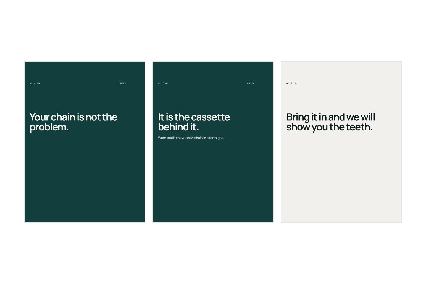
Six decisions carry almost all of it, and none of them is taste. One idea per slide. Type big enough to survive being shrunk. Contrast measured rather than guessed. Nothing that has to be read near an edge. Two typefaces at most, and one is usually better. Space left empty on purpose. Each of the six has a rule you can apply and a way to check whether you applied it, and the checking is the half that actually decides whether a slide gets read.
The problem is not that a slide is hard to make. It is that when a slide is wrong you can see it is wrong and have no idea which thing to change. This is a list of the things to change.
What makes this hard
You are looking at it at the wrong size. You build a slide at full width on a screen, where every word is legible and the arrangement is obvious. It is read at roughly a third of that width, at arm's length, at speed, between two other people's pictures. Almost every fault on a carousel is invisible at the size it was made and unmissable at the size it is seen, which is why the fault survives every check you perform while making it.
A template holds the arrangement, not the amount. It was drawn around six words in the headline. Paste in nineteen and the type shrinks to fit, the margins close up, and the thing quietly stops working while still looking like a design. The template did not fail. It was asked to carry something nobody measured it for, and the measuring is the part that has to be yours.
And the rules are invisible when they are working. A slide that reads well looks like nothing happened to it. So the only examples anybody learns from are the failures, and a failure tells you something is wrong without telling you which of six things it was.
The decisions that actually matter
Six of them, and each has a check that takes seconds.
| The decision | The rule | How to check it |
|---|---|---|
| How much goes on a slide | One idea, one sentence | Say the slide out loud in one breath |
| Type size | Six to twelve words, filling the width | Look at it at thumbnail size |
| Contrast | Dark on light or light on dark, never middle on middle | Turn it black and white |
| The edges | Nothing you need read within a tenth of any edge | Put your thumb over the bottom third |
| Typefaces | One family, two at the absolute most | Count them |
| Space | About a third of the slide left empty | If nothing can come off, add a slide |
The first row is a writing decision wearing a design costume, and it is settled before you open anything. One slide, one claim. A slide carrying two ideas is nearly always two slides somebody was too polite to split, and the order that saves the most work puts the sentences first for exactly this reason. It also decides something later: a slide holding one complete claim is the kind that still makes sense on its own weeks afterwards, which is what gets a post filed and forwarded.
The last two rows are settled by the rules as written. For typefaces, pick one family and get your variety from its weights and sizes rather than from a second face; two faces is a legitimate choice if one is only ever a headline, and three is three voices talking at once. For space, when a slide feels crowded, split it instead of shrinking anything. A carousel gives you eight to fourteen slides, an extra slide costs you nothing, and a cramped one costs you a reader.
Which leaves three that go wrong on almost every first carousel.
What goes into each decision
Type size, which is really a word count
Almost nobody can name the right point size, and nobody needs to, because the size is decided by two other things: how many words there are, and how wide the slide is.
Set six to twelve words and let them fill the width of the slide, margins aside. Do that and the size comes out right by construction, without you choosing it. Write nineteen words and no size is right, because the type has to shrink to fit and the shrinking is the failure.
There is a floor worth knowing, and the arithmetic is quick enough to do in your head. A slide 1,080 pixels wide is displayed around 400 points wide on a phone, so everything on it arrives at roughly a third of the size you drew it. Type set at 40 pixels lands at about 15 points, which is near enough the size of the caption sitting underneath the post. That is the smallest text the app is willing to show anybody. It is a floor, not a target, and a headline should be several times it.
That is arithmetic on a typical screen rather than a published specification, so treat it as an order of magnitude. The shape of it does not change with the handset: whatever you draw, a third of it is what arrives.
The consequence is the one people resist. Fewer words is not a matter of style here. It is the only mechanism by which the type gets big enough.
Contrast you can check
Guessing at contrast fails for a specific reason: you are reading a slide you already understand, so you cannot tell whether the words are legible or merely familiar.
Two colours can differ enormously in hue and hardly at all in lightness, and reading depends almost entirely on lightness. That is why red type on a green ground is famously unreadable while black on white is not. The first pair differs in colour and barely in light, and colour is the first thing thrown away when a picture gets small.
The check takes five seconds and needs no eye at all. Screenshot the slide, open it in whatever photo app is already on the phone, and apply the black and white filter. If the words still separate cleanly from what is behind them, the contrast is real. If they go soft, hue was doing the work, and hue does not survive a feed.
Two rules fall straight out of it. Put type on a plain area rather than on the busy part of a photograph, and if there is no plain area, put a solid band behind the words instead of a drop shadow, because a shadow is what you reach for when the placement is wrong. And avoid a middle tone against another middle tone. Two mid greys, or a mid blue on a mid green, look like a decision on your screen and like fog in a feed.
The edges are not yours
Design to the middle, because the outside of the frame is on loan.
Three separate things take it. A ratio the platform does not support gets cropped to one that is, and the help pages do not say which part of the frame is kept, so the safe assumption is that the middle survives and the edges do not. The same file then gets shown in more than one place: square in your own profile grid, and in vertical surfaces where the app lays its own furniture over the picture, which for Meta's published vertical placements is roughly a seventh off the top and a third off the bottom. Those figures are worth checking once and designing to permanently. And a thumb sits on the screen, over the lower corner nearest whichever hand is holding it.
So the working rule is a margin of about a tenth of the frame on the sides and the top, and considerably more at the bottom. It will feel like a lot of surrendered room the first time you draw it. It is the same room the platform was going to take anyway, and taking it yourself is the only way to choose what ends up inside it.
How to check it before you post
One test replaces most of the judgement, and it costs nothing.
Put the finished set on your phone and look at it in the photo album grid, where each picture sits about a third of the screen wide. That is close to how the first slide is met in a feed by somebody already moving. Read your first slide at that size. If you cannot, it does not read, and the fact that it looks good at full size changes nothing, because full size is a view almost nobody reaches before deciding whether to bother.
Three things fail that test and they fail recognisably. Type set too small goes to grey texture. Contrast that was hue rather than lightness goes soft and muddy. A headline placed low in the frame simply does not get to the eye in time, because at thumbnail size the reader gives the whole picture one glance and it starts at the top.
Then look once more at full size, for one thing only: is the margin identical on every slide? Margins that shift from slide to slide are the most common reason a set reads as untidy when each slide is individually fine, and it is the fault nobody spots, because almost nobody lays their own slides out side by side.
If the first slide reads clearly and still nobody swipes, the fault is not the design. A first slide that answers itself is a writing problem, and no amount of type size repairs it.
Mistakes
- Centring everything by default. Centred is what you get when nothing was decided. Choose centred or left aligned for the whole set and hold it. What reads as designed is the consistency, not the choice.
- Making the type fit the words. It goes the other way. Set the size the slide needs, then cut words until they fit, or move the surplus onto a slide of its own.
- A different treatment on every slide. Variety across a set reads as inconsistency rather than as range. One margin, one alignment, one family, one pair of colours, all the way through.
- A drop shadow, an outline, or a dark wash over the whole picture. All three are repairs for type in the wrong place, and all three are visible as repairs.
- Designing the first slide last. It is the only slide most people will see and it usually gets the least attention, because by the time you arrive at it you are finished and want to be done.
- Filling the space because it is there. Empty room is not waste. It is the thing that makes the words look chosen rather than poured in.
What differs by platform
The rules travel, because they are about eyes rather than about apps. Type size, lightness contrast and margins behave identically anywhere a picture is shown small to somebody who is not concentrating.
What changes is the frame and the furniture. Different surfaces crop to different shapes and put their own controls in different places, so a design that keeps everything in the middle survives all of them, and one that uses the full frame survives exactly the place it was built for. Those shapes move often enough to be worth rechecking against each platform's own pages rather than remembering, and they are the one part of this list with an expiry date on them.
The other difference is the neighbours, and it is the one that argues for restraint. Your slide is never seen alone. It appears between two other people's, in a column, at speed. In a run of busy rectangles the quiet one is the one that stops a thumb, and it happens to also be the only one that can be read at that size. That both of those point the same way is why less on a slide keeps winning against every instinct to add.
None of this takes long to learn, and once learned it is decided rather than debated each time, which quietly settles how often you can post one. So make one carousel and check it three ways: black and white for the contrast, thumbnail for the size, thumb over the bottom third for the margins. We build Kloti, which writes carousels and lays them out, so those three are settled before the deck reaches you, and what the slides actually say is still the part only you can supply.
Written by the Kloti team. Kloti writes and designs a carousel about your work, and the caption to post it with. The pictures on this page were generated in Kloti.