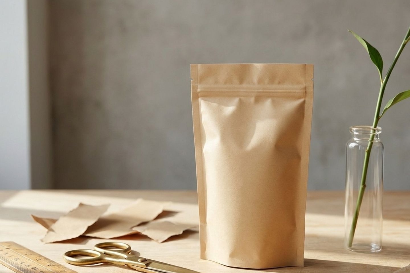
Six pictures, and you can take all six today on the phone in your hand. The photos you need to sell your product are not six angles of one object: they are six answers to six different questions. What is it. How big is it. What is it made of. Where does it live. What do I actually get. Would somebody like me own this. Most sellers with one item take six photos and all six answer the first question.
That is the real problem with having one thing to sell, and it is not a camera problem. What follows is a shot list with the reason attached to each shot, because the reason is the part that usually goes missing. Once you know what a picture is for, you can look at your camera roll and tell what you are still short of.
Why one product is harder than forty
Somebody with forty products gets variety without asking for it. Forty items, forty pictures, and a feed that changes as you scroll. With one item, every difference has to be a decision you make on purpose, and there is nothing on the table doing it for you.
So the failure is predictable. You pick the thing up, you photograph it, you rotate it a little, you photograph it again, and twenty minutes later you have twenty files that are the same picture with the handle pointing somewhere new. They all look fine. Not one of them says anything the first one did not already say.
Two photos are genuinely different only when at least two of these six things have changed:
- Distance. The whole object in frame, or one detail from 10cm away.
- Camera height. Level with the object, 45 degrees above it, straight down, or below it looking up.
- Context. Nothing else in the picture, or the room the thing belongs in.
- Surface. What it is standing on, and whether that surface has a texture of its own.
- Light direction. Where the window is: to the side, behind, or straight on.
- What else is in frame. Hands, the box, a second unit, something of a known size.
Move one of those and you have a variation. Move two and you have a new picture. That is the entire trick, and none of it costs anything.
The six shots, and what each one is for
- The plain one. The product filling most of the frame on a plain surface, nothing else in shot, camera level with the middle of the object. Its job is to be the thumbnail. It answers "what is it" and nothing else, so it has to stay readable at the size of a postage stamp.
- The scale shot. The product in a hand, or beside something almost everybody owns: a mug, a paperback, a phone. Its job is preventing the return. "Smaller than I thought" sends parcels back, and a measurement in millimetres does not fix it, because nobody converts millimetres into a picture in their head.
- The material shot. As close as your camera will focus, frame full of surface, light coming across it from the side rather than from the front so the texture throws small shadows. Its job is proof. Weave, grain, stitching, the seam on a moulded lid.
- The in-use shot. Hands doing the thing the product is for. Pouring, wearing, opening, wiping, holding. Its job is to put the buyer in the picture, and it is the only shot on this list that shows a person something about themselves instead of about the object.
- The in-place shot. Where the thing lives. On the shelf, on the bathroom counter, beside the kettle. Its job is answering "does this fit my house", and it is the one picture here that also works as an advert, because it is the only one with a mood.
- The what-you-get shot. Everything that arrives, laid out flat and evenly spaced, photographed from directly above. Item, box, pouch, card, spare part, instructions. Its job is to answer, once, the question you otherwise answer by email twenty times a month.
If you only manage three today, take 1, 2 and 5. Those three cover the thumbnail, the returns and the reason to want it.
Setting up: one window, one surface, nothing bought
Turn the room lights off. An overhead bulb fights the window and gives you two shadows in two different colours, and one light source you understand beats three you do not.
Put the object beside a window rather than in front of it. Light from the side is what makes shape visible. Light from behind gives you a silhouette. Light from straight on flattens everything, which is why a picture taken with your back to the window looks like a document scan. Then prop something white on the dark side, about 30cm away: a sheet of A3 paper, or the inside of a cereal box. That bounce fills the shadow and is the whole of your lighting kit.
Two surfaces are enough. Something plain for shots 1, 2, 3 and 6, and your actual counter or shelf for shots 4 and 5. Do not pinch to zoom, because that throws away pixels: move your hands closer instead. If your phone has a 2x lens, use it for the material shot, since the wide lens held close bulges whatever is nearest the glass. Tap the product to lock exposure before you press the button. And wipe the lens: a smear you cannot see in the viewfinder turns up as haze across the whole frame.
| Shot | How close | Camera height | In frame with it |
|---|---|---|---|
| Plain | Object fills about 80 percent | Level with the middle of it | Nothing |
| Scale | Arm's length | Level | A hand or one everyday object |
| Material | As close as it will focus | Raking across the surface | Nothing |
| In use | Arm's length or wider | Roughly your own eyeline | Hands, and what it acts on |
| In place | Two steps back, room visible | Level with the shelf or counter | The room, two props at most |
| What you get | High enough for everything | Straight down | All of it, evenly spaced |
Work down that table in order and the six come out different from each other by construction.
If a shot on that list does not apply to what you sell, skip it rather than faking it. A flat pack of stickers has no in-place shot worth taking.
The mistakes that turn six photos into one
Everything from standing height. Phone at chest level, pointed down at roughly 45 degrees, because that is where your arm already is. It is the single reason six photos look like one photo. Kneel for at least three of them.
Flash. Direct flash from 40cm gives a hot white patch, a hard black edge of shadow, and a colour that is not your product's colour. If the room is too dark, wait for morning.
A prop that wins. If somebody has to look twice to work out which object is for sale, the prop goes.
A patterned surface. A busy tablecloth costs you the outline of the product, and the outline is the thing a buyer reads first at thumbnail size.
Expecting white to come out white. It comes out grey, reliably, and it is the camera's metering rather than your paper. That has its own fix, which we wrote up in why your white background came out grey.
One shape for everything. Six tall vertical frames, then the listing wants a square and the crop takes the top off the bottle. Frame a little wider than you need on every shot and keep the uncropped original, so a new format means a new crop rather than getting the product back out and starting again.
What changes by platform
Marketplaces care most about the first image. The common pattern is a plain background, the product filling most of the frame, and no text, logo, border or props. The specifics differ between platforms and they get revised, so read your own platform's image requirements before you start rather than after a listing is rejected.
Social wants the opposite end of the list. Vertical and square crops do the work, and it is the in-place and in-use shots that stop a thumb. Your own site wants the in-place shot widest of all, with a third of the frame left deliberately quiet so a headline has somewhere to sit that is not on top of the product.
All of which comes out of the same afternoon and the same six files, if you shot them wide and kept the originals. Which crop belongs where is a separate question, and we went through it in image sizes that actually matter.
The six shots are a floor rather than a ceiling. One object moved through those six dials on purpose gives more than six usable pictures, and six pictures from one product walks a single item through the whole set frame by frame. Get the six first.
Written by the Kloti team. Kloti writes and designs a carousel about your work, and the caption to post it with. The pictures on this page were generated in Kloti.