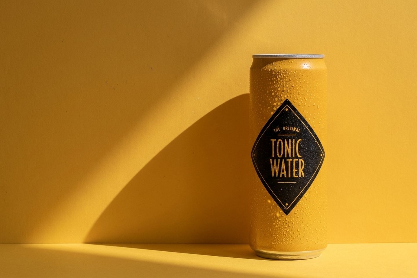
Six different backgrounds for product photos come from describing six different places, not six different backdrops, and from keeping one thing constant across all of them: the direction the light comes from. Your photograph already has a light direction baked into the product. Every scene you ask for has to agree with it. Get that constraint right and the pictures stop looking pasted. Get it wrong and no amount of detail in the background rescues them.
Disclosure first: we build Kloti, which does this kind of scene work, so read this as practitioner's notes rather than a neutral survey.
You have one decent photograph, and you need a listing image, a square feed image, a wide banner, and a few more that do not all look like the same afternoon.
The change in one sentence
Stop naming a background and start describing a place, then make that place's light come from the same side as the light in the photograph you already have.
A background is a noun. Marble. Concrete. Linen. The tool hears a texture and gives you a texture, which is why "on a marble surface" so reliably returns an object hovering on a pale field with no floor, no wall and no reason for its shadow to sit where it sits. Plain white is its own case, covered in why your white background came out grey.
A place has four parts: a surface the product stands on, some depth behind it, one light source you can point at, and something a person plausibly left there. Name those four and the model has enough to build a photograph instead of a swatch. The vocabulary for doing that is its own skill, covered in how to describe your product.
The light clause does more work than it looks like. When a picture reads as fake, the reason is usually not the background. It is that the bright edge down the left of your bottle disagrees with the window you just asked for on the right.
Both versions verbatim
The product is a 250g kraft coffee bag with a printed paper label. The original photograph was taken on a white surface with soft daylight from the upper left, so the bag has a bright edge down its left side and a short shadow falling to the right.
Here is the instruction most people write first.
Coffee bag on a marble surface, minimal, clean background,
professional product photography, high quality, 8k
What comes back: the bag, centred, on a pale smear that could be marble or could be fog. A soft oval underneath instead of a contact shadow, and the bag still lit exactly as it was in your photo, pointing at nothing.
Here is the same request rewritten.
The same 250g kraft coffee bag, unchanged in shape, label and colour,
standing upright on a pale marble kitchen counter, a third of the way in
from the left edge. Behind it, a plastered wall in warm off-white. A
window out of shot on the upper left is the only light source, so the
bag has a bright edge down its left side and its shadow falls to the
right across the counter. A used ceramic cup and a folded linen towel
sit further back, slightly out of focus. Eye level, 50mm lens, shallow
depth of field, fine grain, real texture. No legible text in the frame
except on the bag itself.
What changed is not length, it is category. Every clause fixes a part of the place, or ties the new light to the light already on the product.
That light half is portable on its own. If you change nothing else about how you write, change this.
warm evening light, cosy atmospherea window out of shot on the upper left is the only light source, so
every shadow in the frame falls to the rightThe first is a mood. The second is a physical fact the model can hold to, and one your photograph already committed you to.
What moved and what did not
Some of this is yours and not up for negotiation. The rest is what you are shopping for.
| Part of the picture | Locked or free |
|---|---|
| Outline and shape | Locked |
| Label artwork and wordmark | Locked |
| Colour and finish | Locked |
| Proportions and real size | Locked |
| Direction of the light | Locked across the whole set |
| The surface it stands on | Free |
| The wall or depth behind it | Free |
| Quality and warmth of the light | Free, within a step |
| Props | Free |
| Crop and camera angle | Free |
That middle row is the one people give away. Warmth and softness can move: a cooler morning, a warmer afternoon, a harder shadow edge. Direction cannot. The moment a low sun arrives from the other side, the product is lit by one thing and the room by another, and the eye reads a cut-out.
Six scenes, and the axis each one moves along
- The room it belongs in. Kitchen counter, window from the upper left, a cup behind. The axis is context.
- Held. A hand lifting the bag off that same counter. The axis is human scale, so crop to hands and forearms.
- Straight down. Flat lay with beans, a scoop and a filter, light still entering from the left edge. The axis is camera angle.
- Close. Macro on the folded seam and the grain of the paper, background reduced to a band. The axis is distance.
- Small in a big room. A wide view where the bag takes a tenth of the frame. The axis is how much of the picture it owns.
- A different hour. Late afternoon outdoors, warmer and lower, a longer shadow, still from the left. The axis is time of day.
The common failure is six of number one. Marble, then oak, then concrete, then linen, then slate, then terrazzo. Six surfaces is not six pictures: the height, the distance and the mood are identical, so on a grid they read as one picture with a colour slider under it. Decide the six axes before you write any scenery, and if two slots share an angle, a distance and a light quality, one is spare. A small catalogue makes that harder, which we wrote about in what to photograph when you only sell one thing.
Where it stops working
Four cases, and none of them are wording problems.
Anything with a mirror finish. The reflections on polished metal are a picture of the room the product was originally in, and they stay there in the new one. Keep the crop off the reflective face, or pick scenes with a plain wall the reflection could belong to.
Clear glass and liquids. The background shows through the product, so the model has to redraw what is behind the glass, and refraction and fill level are things it will invent. Expect the level in the bottle to move between pictures.
Fine print. Ingredient lists, dosage text, barcodes, six point type. If the product is redrawn rather than preserved, small type comes back as letter-shaped marks that are not words. Crop away from it.
Unusual sizes. A 5ml vial and a 5 litre drum both come back looking like a 500ml bottle, because the model sizes the product to fill the frame nicely. Put something of known size in the scene and check the ratio.
What to try on your own product
Find the light in the photograph you already have before you write anything. Which edge of the product is brightest, and which way does the shadow fall. Write it as one plain sentence: soft light, upper left, shadow falling right. That sentence goes into all six instructions unchanged.
Then write six empty slots with an axis against each, before any scenery. Context, human, overhead, macro, wide, different hour is a defensible starting set. Only then fill each slot with the four parts of a place.
Look at the six together at thumbnail size first, because that is the test of whether they are actually different. Then open each at full size and check the label and the shadow direction. The point of six is not more pictures. It is that six different questions get answered, and a person deciding whether to buy asks more than one.
Written by the Kloti team. Kloti writes and designs a carousel about your work, and the caption to post it with. The pictures on this page were generated in Kloti.