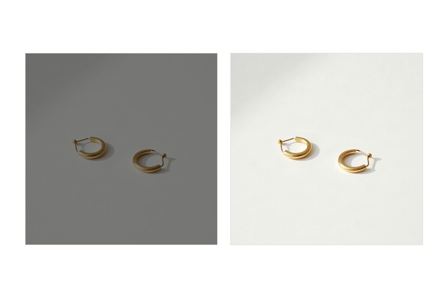
Your white background came out grey because the camera decided it should. A light meter assumes the average scene is a mid tone, halfway between black and white. Fill the frame with white paper and the meter reads all that brightness as too much, then darkens everything until the average lands back in the middle. The paper is white. The exposure is not. That part takes about fifteen seconds to correct.
The blue cast is a separate problem, and the dinginess is often a third. Fixing one does nothing for the other two.
The artifact
A sheet of white paper taped to a wall, curving down onto a table. One product in the middle. Daylight from a window on the left, phone about a metre away, tap to focus, take the picture.
What comes back is flat, slightly cool grey, roughly the colour of a pigeon. The product looks duller than it does in the room, there is a darker band where the paper curves, and the corners have gone dingy. Nobody would call the photo broken. It looks like it was taken in a garage.
What looks wrong
Most people read this as a materials problem. The paper is not white enough, or printer paper was the wrong thing and what is really needed is a light tent, a ring light, a newer phone.
So the light tent arrives, and the picture comes back grey again. At that point people conclude they are bad at this. They are not, and the paper was fine. Nothing you can buy fixes a metering decision, because the meter makes the same decision inside the tent.
What is actually wrong
Three mechanisms, and a bad frame usually has all three.
The meter aims for the middle. A camera measures light bouncing off the scene, not light falling on it, so it cannot tell a white thing in ordinary light from a grey thing in bright light. It follows a rule instead: render whatever it sees as a mid tone. On an ordinary scene that rule is right often enough to be invisible. Fill four fifths of the frame with white paper and it is exactly wrong, so the camera pulls the exposure down by one to two stops. A stop is a doubling of light, or a halving of it. The middle of the range is grey. Phone cameras are cleverer than a plain meter and still do this.
Auto white balance has nothing to work with. The camera guesses the colour of the light by assuming the frame, averaged together, should come out neutral. That needs a mixture of colours. One colour edge to edge gives it almost nothing, so the guess wobbles. Under a warm bulb the paper goes yellow, or the camera overcorrects and the picture goes cold. Out in open shade the only light reaching the paper is the blue of the sky rather than the sun, so the paper goes blue. Grey shows a colour cast far more plainly than white does, which is why so many of these frames are dark and cold at once.
The background has no light of its own. Light weakens with distance faster than people expect: move something twice as far from a window and it gets roughly a quarter of the light, not half. Run that on a desk. The front of the product is 60cm from the glass, the paper behind it a metre. That is not far, and it is enough. The paper receives about a third of the light landing on the product, which is a stop and a half, and a stop and a half below white is grey. A window is broad rather than a point, so reality is kinder than that, but you can see it on the sheet: brighter near the window, dropping away across the paper.
The fix
Overexpose on purpose
Tap the product on screen. A small sun icon appears beside the focus square, and it is a slider. Drag it up until the paper reads white rather than pale grey, usually one to two steps, then take the shot.
Watch the product while you do it. Once the paper looks white, check the brightest part of it: a gloss highlight on a cap, or a chrome ring. If those have gone blank with no texture in them, back off a notch. The background can lose its detail. The product cannot.
Then lock it. On an iPhone, press and hold rather than tap and a yellow AE/AF LOCK banner appears, which stops the phone rethinking exposure between frames.
Pick one colour of light
Auto white balance struggles on a single colour frame, and has no chance when the room holds two kinds of light. Give it one. Turn the room lights off and use the window, or draw the curtains and use the lamp. A warm bulb plus daylight gives a yellow side and a blue side at once.
Then take the guess away, if your app allows it. A white balance control, usually inside a pro or manual mode, lets you name the light: daylight, cloudy, shade, tungsten. If the picture is blue and the only light on it is sky, choose shade and the blue leaves.
Light the background, or back away from the window
Give the paper its own light: a sheet of white card propped on the dark side of the set, angled to bounce window light back onto the sweep. Move the product forward too, a hand's width clear of where the paper begins to curve, so its shadow falls on the table rather than up the background.
Or move the whole set away from the window. Close to the glass, light drops steeply across even 40cm of depth. Push the table back so the product is two metres out and the paper 2.4 metres, and that same gap costs about half a stop instead of a stop and a half. Everything is dimmer, so prop the phone against something solid. Even light beats bright light.
One thing that is not a fix. The temptation, once the grey photo exists, is to drag brightness right until the background looks white. That raises the product too, so it goes pale and its mid tones flatten, and the contrast you add to recover it pushes the darker tones into solid black. You have traded a grey background for a product with no middle in it.
Local tools do worse. Dragging the white point until the paper clips to pure white also clips the soft pixels at the edge of the product. Those pixels are the edge. Clip them and a bright rim appears around the outline, which is what a halo is. It shows first on anything soft, fabric and fur and steam, which is one reason garments have their own set of problems.
What is still broken
Do all of that and the background comes out a clean, bright near-white with a gentle gradient across it. That is what a well lit sheet of paper looks like photographed, and it is not pure white. It never will be, because paper returns less light than falls on it.
A background that is uniform, absolute white is a compositing job. Somebody cuts the product out and drops it onto a filled layer. A marketplace demanding a pure white main image is asking for that rather than for a photograph. That is a platform rule, and it belongs with the other file requirements worth checking first.
What the cut-out costs you is the shadow. A product on paper has a dark, tight contact shadow where it touches, and that shadow is the only thing telling the eye it is resting on something. Take the background away and the product floats, which reads as a mistake even to people who cannot say why. The usual compromise is a soft grounded shadow and a background that is very light grey.
One case stays harder than the rest. A white product on white paper needs the background lit brighter than the product, or its edges vanish into it.
The plain background shot is one picture. Get it right, because every platform asks for it, then treat it as the least interesting of the several pictures one product owes you.
Written by the Kloti team. Kloti writes and designs a carousel about your work, and the caption to post it with. The pictures on this page were generated in Kloti.