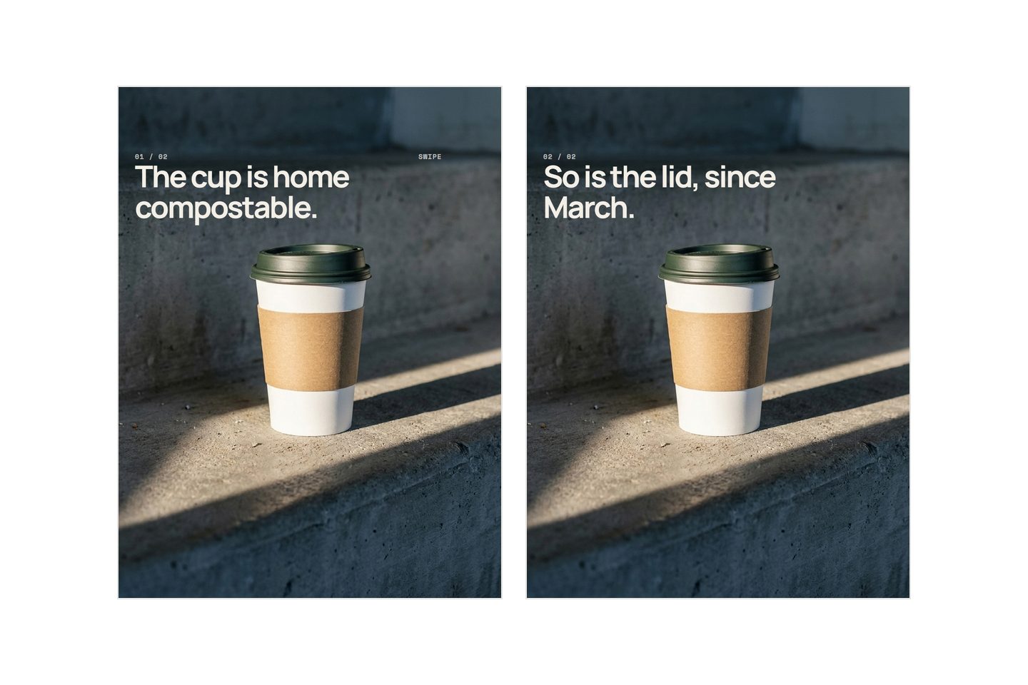
Text from an AI image generator looks wrong because the model is not writing text. It is drawing the appearance of text: marks that sit where letters sit, in the rhythm letters have, without any one of them being a letter. No prompt fixes that. The fix is to stop asking for it. Generate the picture, then put the words on top as a layer you can edit.
That is not a workflow preference. It settles what you can do with the picture afterwards.
The artifact
A headline that reads at a glance and, up close, is not English. A brand mark with the right silhouette and a wrong interior. An ingredients panel that is grey rhythm with no letters in it.
The shapes it takes are consistent:
- A word that is almost the word: one letter transposed, one doubled, one invented.
- A letter that is half of two letters, usually where a round shape meets a stem.
- Writing in the background, on spines and packaging and signage, none of which says anything.
What they share is that the letterforms are good. The weight is even, the spacing is the spacing a typesetter would choose. Only the words are not words.
What looks wrong
It looks like a spelling mistake, so it gets treated like one. You retype the word in capitals, put it in quotes, say it twice. Several attempts go by before most people accept they are not looking at a typo.
The second part is the wrong way round. You check the picture scaled into a preview pane, and at that size everything passes. The buyer sees it full width on a phone, or taps to zoom. The small type fails first, and small type is exactly what you did not check.
Nearly right is more expensive than obviously wrong. Obviously wrong is deleted in the first second. Nearly right gets approved, scheduled, posted, and found by somebody who is not you.
What is actually wrong
The model has no representation of a character as a symbol. It never learned the letter E. It learned what pixels tend to look like in the places an E has been.
Compare any writing tool on your computer. Type SALE and the machine stores four codes, one per character, then asks a font file for the shapes. The string exists apart from its appearance, which is why you can change the typeface and keep the word. An image model holds no such string, and no step where a word is set. It has one step, and that step produces pixels.
What it does hold is a good statistical account of what text looks like: dark marks of even height on a shared baseline, gaps of a characteristic width, blocks with margins around them. That is a texture, and texture is what these models are best at. Asked for a label, it produces the texture of a label, in the right place, catching the right light. Whether the marks spell anything is checked nowhere, because nothing in the process holds a word as a word.
That explains the size behaviour. A famous wordmark often survives large, because a mark seen everywhere has been memorised as a shape, the way a bicycle is a shape: the model is drawing a logo, not spelling a name. Your own mark, if it is not all over the internet, gets whatever the model thinks that shape looks like.
Then make it smaller. At six point on a pack a letter is a couple of pixels wide, there is no distinctive shape left to have been memorised, and nothing comes back but the texture. Legibility falls away as type gets smaller, which is the wrong direction, because small print is where the weight in grams and the claims live.
Why "clear legible text" makes it worse
A constraint works only if the model has some representation of the thing being constrained. Ask for a low camera angle and you get one, because angle is a property of pictures that varies across everything the model has seen. Correct spelling is not a property of a picture in that sense, so there is no dial to turn.
What you turn up instead is confidence. The strokes get cleaner, the letterforms get more convincing, and the result is nonsense that looks deliberate. That is worse than blurry nonsense, because it survives a glance.
The one instruction that does work here is the negative: keep text out of the picture. Suppressing a texture is something the model can do, correcting it is not. Describing the scene is worth the effort, and how to describe your product covers the part of a brief that responds. Describing the letters is not.
The fix
Two steps, in this order. Generate the picture with no words in it and somewhere for words to go: a plain wall, an out of focus floor, a quiet corner. Then set the words on top, in a real typeface, as a layer that stays a layer.
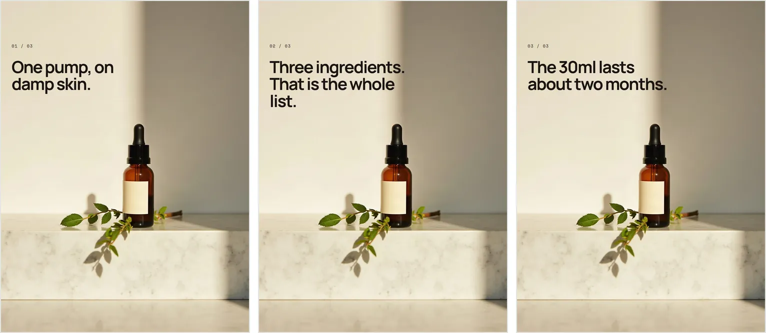
Everything useful about this arrives later, when something has to change.
| What changes | Words in the picture | Words on a layer |
|---|---|---|
| Fix a typo | New picture | Retype it |
| Another language | New picture | Swap the text |
| Square into vertical | Words crop with it | Words re-wrap |
| A different line per slide | Six pictures that must match | One picture, six lines |
| A better photograph | Both change | Replace one, keep the other |
The first row decides the architecture. If the words are inside the picture, correcting a letter means producing a new picture, and the new picture is not the old one: the light shifts, the fold in the cloth moves, the shadow lands somewhere else.
On a single image you can live with that. In a set you cannot. Slide three comes back belonging to a different afternoon than slides two and four, and someone swiping past will see it without being able to say what changed. Regenerating the other five does not rescue it, because they drift too. Holding a set together is most of what a carousel does, which is the argument in what a good product carousel says.
Reflow matters nearly as much, because formats change under you. A layer re-wraps when the frame does, while baked words get cut in half by the crop that was supposed to be free. The sizes you are cropping between are in image sizes that actually matter.
Most tools that put words on pictures already work this way, and ours does too: Kloti generates the picture and lays the words over it rather than into it.
What is still broken
A layer does not help when the text has to be on the product. Printed packaging, a bottle label, an engraved lid. That text sits in perspective, wrapped around a curve, under the same light as everything else, while an overlay lies flat in the plane of the picture, where it reads as a sticker.
No wording rescues that. What is left is choosing around it: crop the fine print out of frame, angle the pack so the panel is not the subject, composite a photograph of your real label onto the render, or accept that the small print here is decorative, with no claim depending on it.
The other unfinished part is the overlay, which looks stuck on unless somebody has thought about it. What separates one that belongs:
- Leave the space when you generate rather than hunting for it afterwards. A picture composed with a quiet third is not the same picture as one cropped into submission.
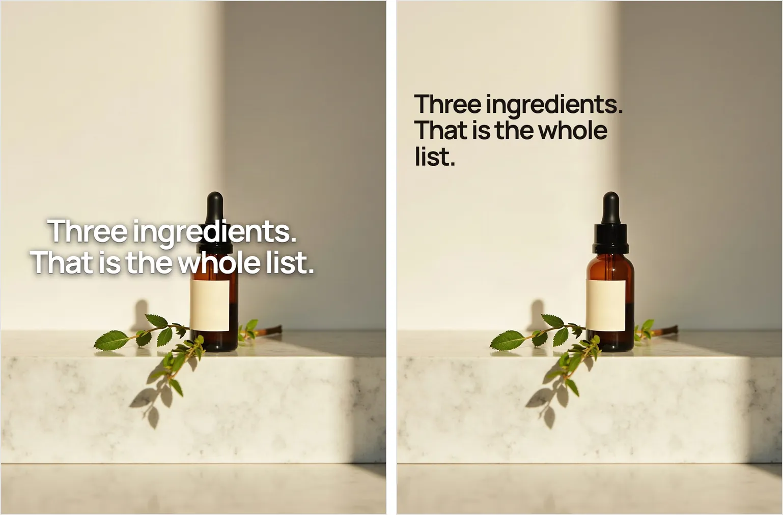
- Set the type for the photograph: dark words on a pale wall, pale words on a dark one, rather than darkening the image so that white type works.
- Keep one margin and one alignment across a set. Margins that move from slide to slide read as carelessness before anyone can say why.
- Do not run words across the product's own outline, and skip the drop shadow. A word that needs an outline is in the wrong place on the picture.
The check, before anything goes out: open the file at full size and look at every surface that would normally carry writing. If there is text in the picture that needs to be right, it is in the wrong place, and rewording the prompt will not move it.
Written by the Kloti team. Kloti writes and designs a carousel about your work, and the caption to post it with. The pictures on this page were generated in Kloti.