
People can usually tell a generated product photo from a real one, and they are usually not able to say why. They just do not trust it. That reaction is not mystical. It is a small number of specific, repeatable errors, and once you can name them you stop producing them, because most of them are decisions rather than accidents.
Eight tells follow. Each one has a cause at the model level, which matters, because the fix for a cause is different from the fix for a symptom. Adding "photorealistic, 8k" to a prompt is a symptom fix and it makes several of these worse.
1. The product floats
The most common and the most damaging. The product sits in the frame with no contact shadow, or with a soft grey ellipse under it that does not match the geometry of anything else. Your eye reads it as a sticker on a wallpaper, because that is literally what it is.
Why it happens. If the background was generated separately and the product was cut out and pasted on, nothing in the process ever established where the floor is. The product has no y coordinate in a 3D sense. It has a position in a 2D collage.
What to do instead. Give the scene an actual surface, name it in the brief, and put the product's base on the surface line rather than in the middle of the frame. This is the cheapest fix on the whole list, and it is usually the difference on its own. What resolves it is not a better model. It is a described scene with a known surface height and a product anchored to it.
Then look at the shadow itself. A real contact shadow is dark and tight where the object meets the surface and it opens up and softens as it moves away. A generated one is often uniformly soft, which reads as fog rather than contact.
2. Light that comes from two places
There is a window on the left. The shadow also falls to the left. Nobody notices consciously, and everybody notices.
Why it happens. Diffusion models learn what lit scenes look like, not how light propagates. They will happily paint a beautiful highlight and a beautiful shadow that imply two different suns, because both patches individually look like things the model has seen.
What to do instead. Trace one line. Find the brightest thing in the frame, then check that every shadow points away from it, including the shadow under the product, the shadow the product casts on the wall behind it, and the shadows of any props. If the product was composited in, this is where the mismatch always shows, because the light on your original packshot came from your original shoot.
3. Centred subject, blurred gradient behind it
The single object dead centre, softly lit, floating on a tasteful blur. It is not exactly wrong. It is just the picture the model makes when you did not tell it anything.
Why it happens. Two reasons compound. The model's prior for "product photo" is a studio pedestal, because that is most of the training data with that caption. And strict identity instructions push it further that way: the tighter you constrain a model to preserve the product exactly, the more it retreats to the safest, most literal composition it knows. It is worth keeping an explicit list of cliches you refuse in a brief, because they arrive by default: plain white background, wooden desk with a plant, generic studio, floating pedestal.
What to do instead. Ask for off-centre magazine composition explicitly, and describe a room rather than a backdrop. Not "on a marble surface" but a scene with a wall, a light source, a second surface behind, and one or two props that a person would plausibly have left there. The difference is between describing a background and describing a place.
4. Garbled text on your own packaging
Your label comes back with letterforms that are nearly right and words that are not words. For a brand this is the most expensive failure on the list, because the product is unusable and unfixable.
Why it happens. If the model redraws the product rather than compositing it, your label is not preserved, it is reconstructed. At large sizes reconstruction works, because a wordmark is a shape the model can hold onto. At small sizes it does not, because six point type is below the resolution at which the model has any structural understanding of what it is drawing. Small print is where this shows up first, and no amount of prompting reliably rescues it.
What to do instead. Stop asking the model to draw your text. Composite the logo on afterwards, and keep headlines and legal copy as editable layers over the render rather than baked into it. If the product must be redrawn and it has fine print, either accept that the fine print will be decorative or choose a crop that does not show it.
One related trap: keep hex codes out of your prompts. Models cannot read them as colours, and they will occasionally draw the code into the image as visible text. Colour names work. "Cream ivory beige" works, and if you write "warm" expect the model to read it as rose or pink rather than as warmth.
5. The background is talking nonsense
Book spines, wall art, shop signage, a magazine on the table. Look closely and none of it says anything. It is a texture that has the rhythm of writing.
Why it happens. Same mechanism as the label, with nobody watching. All the attention in a product brief goes to the product, so nothing constrains the background, and any surface in the training data that usually carries text will be given something that resembles text.
Here is our own example, because pointing at other people's output would be cheap:
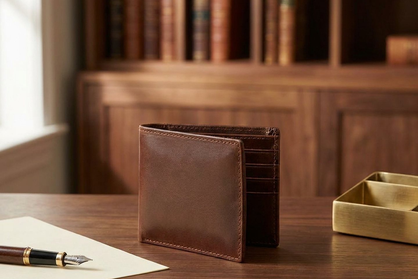
The cover image on this post is one of our own showcase renders, a leather wallet on a desk with a bookcase behind it. The book spines carry gilt bands and marks in exactly the places a spine carries a title and an author. None of them are words. The shallow depth of field hides it at thumbnail size, and at full size it does not hide it at all. That image is on our site, we chose it, and we are pointing at it rather than quietly swapping it.
What to do instead. Name the background elements you want and exclude legible text from the brief. Use depth of field as a real photographic decision, not as a way of laundering an error. And zoom to 100 percent on every surface in your frame that would normally carry writing before you publish. That check takes about ten seconds and it is the one nobody does.
6. Scale that reads wrong
A 30ml serum bottle the size of a wine bottle. A mug that would not fit in a hand. Nothing in the image is individually wrong and the whole thing feels off.
Why it happens. The model has no metric knowledge of your product. It knows the shape you gave it and it knows what makes a pleasing composition, so it sizes the product to fill the frame nicely. If you pre-shaped the product onto a canvas yourself, you chose the size, and you probably chose it to look good rather than to be right.
What to do instead. Put something of known size in the frame and check the ratio against reality. A hand, a mug, a book, a standard countertop depth. If the ratio is wrong, fix the product's size on the input canvas rather than re-prompting, because that is where the number lives.
7. Materials that go plasticky
Matte finishes turn glossy. Fabric loses its weave. Leather gets an even sheen that no leather has. Everything acquires the same slightly rubbery surface.
Why it happens. Partly the model, and partly the words people add to prompts. Terms like "8k", "hyperreal", "octane" and "render" pull the output toward 3D rendering and product visualisation training data, which is exactly the plastic look you were trying to escape. Adding them to fix realism reliably reduces it.
What to do instead. Ask for photography, specifically. Name a film stock, natural directional window light, shallow depth of field, fine grain, realistic textures and subtle imperfections. Imperfection is the important word in that list. Then check the material after the render, not just the shape. Matte black is the usual casualty: it drifts warm and comes back brown, and it takes another attempt to get it back. Colour and finish drift is as much an identity failure as a garbled logo, and it is easier to miss because the image still looks good.
8. Every image is the same image
The subtlest tell, and it operates across a feed rather than inside one frame. Twelve posts, same framing, same light, same mood. Individually fine, collectively obviously machine made.
Why it happens. Two mechanical causes. Same seed plus same instruction gives you the same image, so people who vary only the output size are paying for duplicates. And human written prompts converge, because we each have a small number of scenes we think of. When we wrote the briefs for our own before-and-after set by hand, the results were safe and repetitive, and we ended up throwing them out in favour of scenes written by a model with an instruction to be genuinely different from each other.
What to do instead. Vary the shot type on purpose, not the wording. In use with hands, styled flat lay, macro detail, motion, lived-in wide. Change the scene rather than the seed. And expect to cull: anything with a person in it should be cropped to hands, torso or a side profile to avoid the faces, and you should assume you will throw some away.
The sixty second audit
Before you publish, in this order. Where does the product meet the surface, and is there a dark tight shadow there. Where is the brightest thing in the frame, and do all the shadows agree with it. Zoom to 100 percent on the label, then on every background surface that could carry writing. Compare the product against one known-size object. Check the material and the exact brand colour against your real product, not against your memory of it.
What prompting cannot fix
Two of these are structural and worth knowing so you stop trying.
Small text on a redrawn product will not become reliable. It is a resolution limit in what the model is doing, not a wording problem, and the fix is architectural: composite the text instead of generating it.
Full graphic design in one pass will not become good. We tested generating complete promo graphics, layout and typography and imagery together, in a single diffusion pass. The output is good at imagery, mediocre at type and poor at hierarchy, and it converges on a recognisable look: one font, thin information, occasional garbled words. We could not prompt our way out of it. What worked was splitting the job, generating the imagery and rendering the text and layout in code with real font files, which is how Kloti works now.
Everything else on this list is a decision you can make differently on your next generation. If you want the money side of the same argument, what a product shoot actually costs a small brand covers when a camera is still the right call.
Written by the Kloti team. Kloti is an AI visual studio for product and service ads. Every image on this page, cover included, was generated in Kloti.