
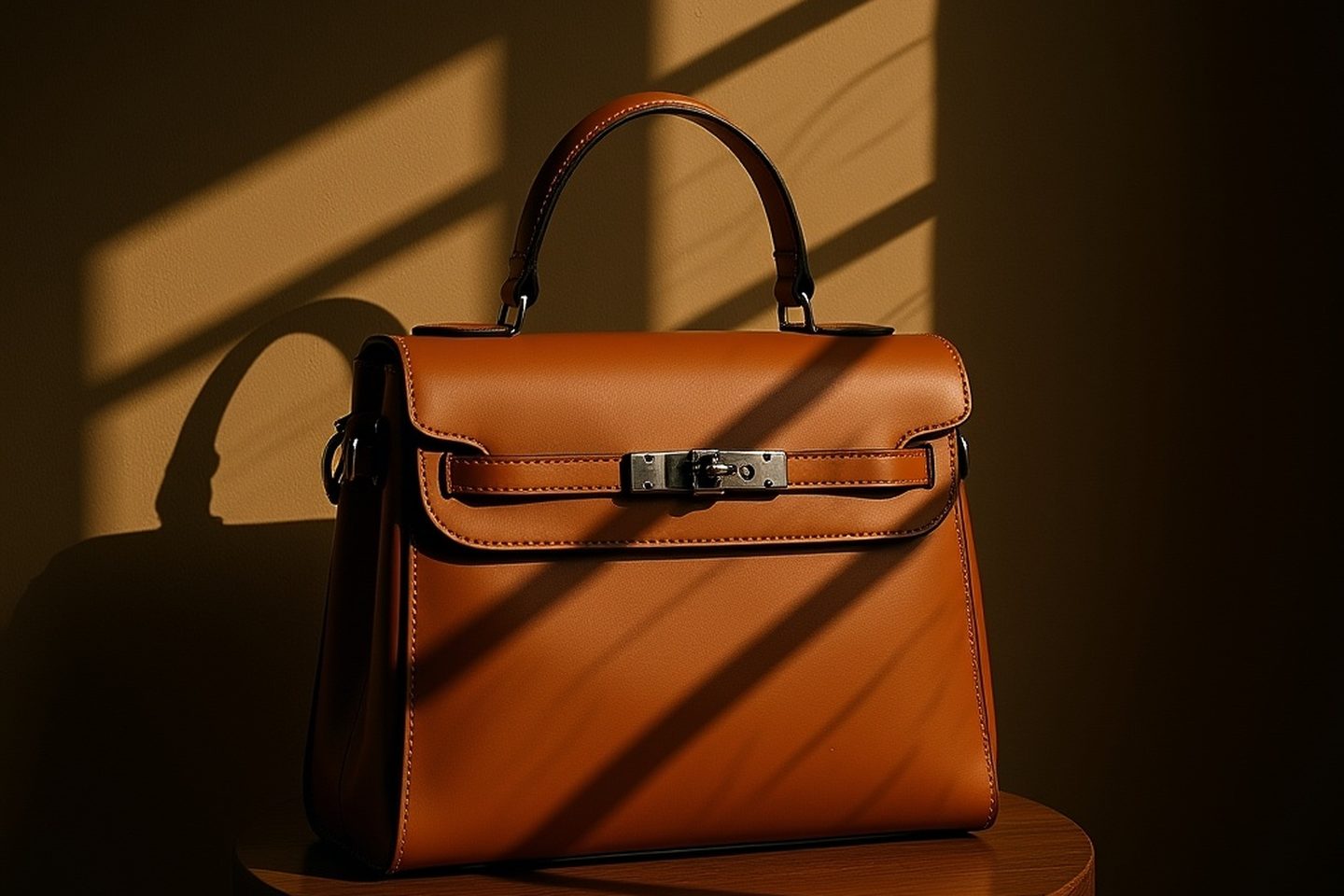
Most beginner jewellery advice ends up at the same equipment: a light tent, two lamps either side, maybe a ring light, and the goal stated as "even lighting, no harsh shadows". Follow it exactly and a hand-raised silver cuff that looks alive on the bench comes back looking like a grey plastic prop. Nothing is out of focus, nothing is badly exposed, and the piece has lost every quality you spent three hours putting into it.
That is not a skill problem. The advice is wrong for this specific material, and the reason is physical rather than aesthetic.
Two kinds of surface, and jewellery is the unusual one
A matte ceramic mug scatters incoming light in every direction. It shows you its own colour, it looks roughly the same from any angle, and you can light it almost any way you like without breaking it. Nearly everything people photograph behaves like this, which is why the general advice works in general.
Polished metal does almost none of that. It reflects, at an angle, in a direction, and the colour it sends to your camera is not really its own. When you photograph a silver ring, you are photographing the room: your ceiling, your walls, the window, the pale rectangle of your own torso leaning over the bench. The metal is the lens, and the room is the subject.
Say that back to the standard advice and the problem is obvious. "Evenly lit" ends up meaning "surrounded by one uniform bright tone", and a mirror surrounded by one uniform bright tone reflects one uniform bright tone. You have carefully built a room with nothing in it and then taken a picture of that room.
Two things are destroyed by this, and they happen to be the two things a buyer is looking at.
Form. The only reason a curved metal surface reads as curved in a photograph is that the reflection changes across the curve: bright along one part, darker along another, often with a hard line where the edge of the room's brightness falls across it. That gradient is the shape. Take the variety out of the surroundings and the curve flattens into a shape filled with grey.
Texture. Hammer marks, planished facets, a solder seam, the grain in a brushed finish. Each of those is a small change in the angle of the surface, and it is visible only because it points at something different from the patch next to it. In a white box every facet points at white, so the surface that justifies the price disappears.
Build the surroundings, not the lighting
The useful reframe: stop asking how much light is falling on the piece and start asking how much difference there is in what surrounds it.
In practice you need two things, and most people only own the first. One broad, bright source with a defined edge. A window with the rest of the room fairly dark, or a sheet of white card lit by a lamp and held close. Broad, because a wide source gives the metal a highlight with some length to it rather than a dot. Defined edge, because the edge is what draws the line across the curve.
The second thing is something dark, and it does at least as much work. A piece of black card, standing on the opposite side to the light, angled at roughly forty five degrees. It puts a dark band into the metal. That band does two jobs: it gives the bright highlight a boundary, so the highlight becomes a shape instead of a haze, and it gives the outer edge of the piece a dark line, so the silhouette holds even against a light background.
Move the black card in and out and watch the metal rather than the meter. There is usually a position where the piece snaps from looking like grey plastic to looking like silver, and it is a smaller movement than you expect.
Stones want the opposite thing
A faceted stone is not a small mirror, it is a large number of small mirrors pointing in many directions, and what makes it look like a stone rather than a lump of resin is that a few of those facets return a sharp flash while their neighbours stay dark. That contrast is what people mean by brilliance, and it requires a small, hard source. Diffusion is what kills it. A stone photographed in a light tent is uniformly lit from everywhere, so every facet returns the same soft glow, and the result looks convincingly like plastic because plastic is exactly what a diffuse imitation stone looks like.
So a piece with both metal and a stone is asking for two contradictory things at once, and that is the real difficulty of the category rather than anything about focus or resolution.
The workable answer is both sources at once. Keep the broad source shaping the metal, then add one small hard light on the same side: a phone torch, a bare bulb, a gap left in the diffusion. Then move it in small steps while watching the stone only. The angle that fires a stone is narrow, and it is found by moving a few centimetres at a time rather than by turning anything up.
Finish means you have three products, not one
Most makers arrive at one lighting recipe and apply it across a catalogue containing three materially different surfaces.
Polished is the mirror case above. Reflections stay sharp, so it needs the most control over what is around it, and it is the finish most damaged by a uniform white surround.
Brushed or satin smears each reflection into a streak that runs along the direction of the grain. This changes what kind of source you want: a long source, a strip or the edge of a window, reads far better than a round one, and rotating the piece relative to the light does more than moving the light does. If a brushed band looks dull, the grain is probably running the wrong way relative to your source.
Oxidised, matte and heavily textured behave much more like a normal diffuse object. This is the one lane where flat, even light is not fatal, and it is also the lane where the recipe that saved your polished pieces will look muddy, because a dark matte surface in dark surroundings has nothing to give back.
Sorting a catalogue into those three piles before a session is a five minute job that changes more than any equipment purchase.
The ground colour is a lighting decision
Everything within reflecting distance of the piece is in the photograph, and for a ring lying on a surface the largest single object in its world is that surface.
This is why the usual styling advice about background colour is not really styling advice. A cool grey surface under gold makes the gold look brassy and cheap, because the gold is literally showing you a picture of grey. Warm charcoal, deep green, oxblood and warm bone all flatter gold and brass for the same reason in reverse. Silver and cool metals do better on a deep cool ground or on bone.
Deep grounds have a second benefit, which is that a bright specular highlight needs something to be bright against. Pale grounds work well for delicate and minimal pieces where the appeal is the line rather than the shine. They work badly for anything whose selling point is that it catches light.
Then what about the white background rule
The objection at this point is that marketplaces demand a plain white main image, so surely the white box was right all along.
Those are two separate requirements and it is worth keeping them apart. A white background is a requirement about what surrounds the product in the final file. It is not a requirement about what surrounded the product while you were shooting. You can photograph a piece properly, against dark card, with a shaped highlight and real form, and then cut it out onto white. What you cannot do is recover form that was never captured, because a flat grey ring is flat grey at every stage after the shutter.
Shoot for the metal. Compose for the surface later. Which slot each version belongs in is a separate decision worth making on purpose.
If you are generating the scene rather than shooting it
The same physics applies to the brief, and the brief is where most people leave it out. "Well lit studio" produces the flat grey result for exactly the reason above, because a model's idea of a well lit studio is a soft, even, bright space. Ask for the thing that actually makes metal read: light hard from one side, a specular highlight running along the top of the band, a deep ground, a dark fall-off on the shadow side.
On review, look at the reflections rather than only the shadows. A convincing metal surface reflects the scene it is standing in. When a piece shows a bright window on its flank and there is no window anywhere in the frame, that mismatch is the tell, and it is a close cousin of the other giveaways in generated product shots.
What to look at first
Open your best jewellery photograph at full size and look only at the brightest area on the metal. Ask one question about it: does it have an edge and a shape, or does it fade away gently in every direction? A haze in every direction means the surroundings were uniform, and that single observation explains most of what is wrong with the picture.
Then look for a genuinely dark area on the piece. If there is not one, the piece has no outline of its own and will read as grey at any size.
Neither of those is fixed with a better camera. They are fixed with a piece of black card and a window, and then the remaining problem is that a beautifully lit macro shot still does not tell anyone how big the thing is.
Written by the Kloti team. Kloti is an AI visual studio for product and service ads. Every image on this page, cover included, was generated in Kloti.