
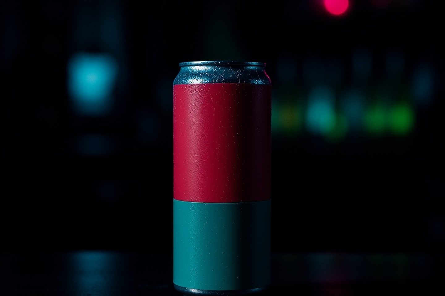
You have a render of the product you are happy with. You have a headline you have rewritten four times. You put the headline on the render, export it, and the result looks like a slide from a school presentation. Nothing in it is wrong. It just does not look like something a brand paid for.
Most people respond by going back to the two things they can see. They regenerate the image, or they rewrite the headline again. Neither one is usually the problem. If the photograph itself is the problem, that is a different piece and the tells are specific. What is missing here is a whole category of small graphic parts that finished design work carries as a matter of habit, and that first attempts leave out almost completely.
Run the count yourself
Open any poster, magazine ad or packaging design you think looks professional. Do not look at the picture or read the headline. Count the small graphic elements instead: badges, boxes, lines, tags, marks, tiny labels.
You will usually find three or more. Then look at your own first attempt and count the same way. You will usually find none, or one.
That gap is most of the difference between the two pieces. It is not talent and it is not budget. It is a habit that designers acquire early and that nobody who has not done the job would think to imitate, because these parts are invisible when they are present and only conspicuous when they are absent.
The parts, and what each one is doing
A circular badge. The offer, the price, the "new", the percentage off. Usually a filled circle with two or three lines of type inside it.
A hairline keyline. A thin rule running around the whole design, inset from the trim by a consistent margin, often 3 to 5 percent of the shorter edge. It costs nothing and it does an enormous amount, because it declares that the edge of the canvas was a decision rather than where the image happened to stop.
Dividing rules. A short line between the headline and the body, or above the footer. It groups things that belong together, which is the actual job of layout.
A rounded pill for the call to action. A button shape, even in a medium with no buttons. Readers have been trained by a decade of interfaces that this shape means "the thing to do", and the training transfers to print.
A row of small labelled icons. Three or four tiny marks with a word under each: refillable, 30 day returns, made in Kent. This is the row that makes a poster look like it came from a company with a warehouse.
Corner crop marks. Borrowed from print production, where they told the guillotine where to cut. Used decoratively they signal "this was prepared for print by someone who prepares things for print". Use them lightly. They are a costume, and four sets of them on a social square is a costume worn badly.
A ribbon or a corner tag. A shape that sits at an angle across a corner, carrying two or three words. It is the single fastest way to add a second read to a layout.
A small caps label. Two or three words at the top, letterspaced wide, at a size almost too small to read. New season. Limited run. Volume 03. It is doing the job of a title page in a book.
You do not need all of these. Two or three, chosen for what the piece actually has to say, will move a design further than anything else available to someone without design training.
The circle is doing more work than you think
There is a reason the offer badge is a circle so often, and it is not tradition.
A layout is made of rectangles. The canvas is a rectangle, the image is a rectangle, every block of type sits in an invisible rectangle, the margins are rectangles. Everything agrees. Then you put a circle in it, and the circle is the only object in the composition that does not share the logic of everything else. The eye goes straight to it and stays there for a moment before moving on.
That is the whole mechanism. It is a singularity, and attention is drawn to singularities. Which means two practical things. First, put the thing you most want read in the circle, because you get one of them and you are spending your strongest attention lever on whatever goes inside. Second, one circle. Two circles are a pair of rectangles again, in the sense that neither is unique any more, and they cancel each other's pull.
Three type sizes reads as a form
Count the distinct sizes of type in your design. Not the number of text blocks, the number of genuinely different sizes.
Most first attempts run three: a headline, a subhead, and a footer line. Everything belongs to one of the three, and the result reads as a filled-in template even when each individual choice is defensible. That is the impression to name, because it is the one your customer forms without words. It looks like a form somebody completed rather than a thing somebody made.
Finished work usually runs five to nine, and the important part is the range rather than the count. There should be a large gap between your biggest size and your smallest one, larger than feels comfortable. If your headline is 72 point, something in that design should be 9 or 10 point. When the largest is 72 and the smallest is 24, everything shouts at once, and shouting at one volume is the same as speaking at one volume.
The sizes in between are not decoration either. They are how a reader knows what to read second.
Something should overlap something
Here is the structural version of the same problem. Look at your layout and ask whether every element is sitting inside its own reserved rectangle, politely, touching nothing.
If it is, the design will read as a form no matter how good the individual parts are. Reserved boxes with gaps between them is what a document looks like. Overlap is what a designed thing looks like.
The fix is small. Let the badge break the edge of the photograph. Let the headline sit partly over the product, in the area where the background is dark and empty. Let a rule pass behind the logo instead of stopping short of it. Let the product itself break the keyline you inset from the edge, which is a trick worth keeping, because a keyline broken in exactly one place looks deliberate and a keyline broken in four looks like an accident.
One overlap is enough. It is the presence of the relationship that changes the read, not the quantity.
Real fine print beats another adjective
There is almost always a moment near the end where the temptation is to strengthen the headline. Add a word. Make it "beautifully refillable" instead of "refillable".
Put something at the margins instead. An availability line. A date and a place. A URL. A batch number, a size, a volume, a "while stocks last". Set it small, set it in the corner or along the bottom edge, and let it be genuinely informative rather than decorative.
Fine print does something an adjective cannot. It implies a world outside the poster: a shop that has stock, a date that will pass, a website that exists. An adjective only implies an opinion, and the reader already assumes you have a good opinion of your own product. This is also the cheapest line in the design to get right, because you are not writing copy, you are transcribing facts you already know.
When to leave all of this out
Everything above has a failure mode, and it is worth being blunt about it, because the advice reverses completely at the top of the market.
Restraint is a signal too, and it is a more expensive one. A luxury fragrance, a high end skincare line, a piece of furniture that costs four figures: these get a product, a wordmark, a great deal of empty space, and nothing else. That emptiness reads as confidence, and confidence is what the price is buying.
Put a starburst on a luxury product and you have not made it look busy. You have made it look discounted, which is worse, because the whole proposition of that product is that it is not something you find in a discount bin.
The distinction is not taste, it is category. Graphic furniture says "there is an offer here, act on it", and that is exactly right for a promotion, a launch, a seasonal push, a marketplace listing competing against nine others in a grid. It is exactly wrong for a piece whose job is to make the product feel rare. Decide which of those you are making before you start adding, and the choice mostly makes itself.
What to do on your next one
Take the design you already have and do four things to it.
Draw a keyline inset from every edge by the same margin, then let exactly one element cross it. Add one circle carrying the single most important thing you have to say. Find your smallest piece of type and make it genuinely small, small enough that you are slightly nervous about it, then add a real fine print line at the bottom edge with a fact in it. Finally, move one element so it overlaps another.
That is roughly ten minutes of work, and none of it requires design training or another render. Keeping your headline and logo as real editable layers over the image rather than baked into it is what makes ten minutes possible instead of a regeneration, which is why Kloti's editor works that way.
Then run the count again. If you can find three pieces of furniture in your own piece and you could not before, the gap you were looking at has mostly closed.
Written by the Kloti team. Kloti is an AI visual studio for product and service ads. Every image on this page, cover included, was generated in Kloti.