
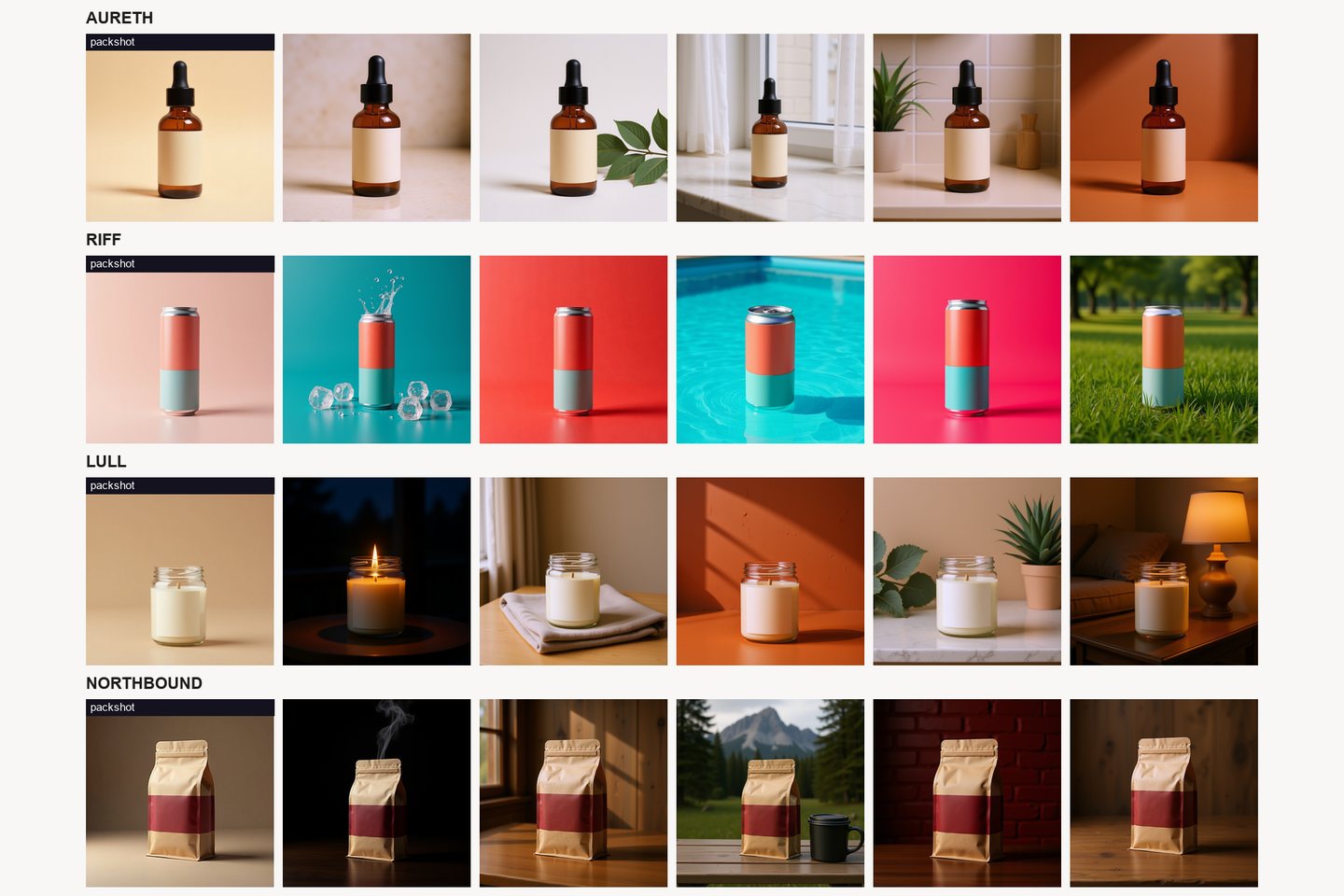
Most small sellers end up with one good product photo and four places to put it: the marketplace listing, the feed, a story, and a paid ad. The same square goes to all four. It works properly in one of them, and nothing about the image is wrong. It is the wrong shape, cropped at the wrong point, carrying the wrong amount of text, for the surface it landed on.
That is a distribution problem wearing a design problem's clothes, which is why it is so hard to see. When a post underperforms, the instinct is to make a better picture. Often the picture was fine and it simply arrived somewhere that gave it a third of the screen it needed.
The four shapes, and what each is actually for
Square, 1:1. The shape that survives a grid. Profile grids, marketplace search results, product tiles on your own site, suggested-product rows. It is the safest shape and the weakest one in a vertical feed, because it occupies the least screen of any option a feed will accept.
Portrait, 4:5. The tallest a still post is usually allowed to be in a feed. At the same width, a 4:5 image is 25 percent taller than a square, so it holds the screen 25 percent longer at the same scrolling speed. That is the whole argument for it and it is enough of one. The catch is that the profile grid will show it as a square, so whatever you put in the top and bottom fifth is decoration, not content.
Full vertical, 9:16. Stories, reels, vertical video, and the vertical placements inside most ad sets. It fills the phone. It is also the shape with the most interface sitting on top of it, so it has the least usable area of the four despite being the largest.
Landscape, 16:9 and wider. Website headers, email banners, video thumbnails, anything read on a desktop. In a phone feed it is the least effective shape available, because it takes up the smallest slice of vertical scroll. Plenty of brands use their website hero as a feed post and cannot work out why it disappears.
The frame is not the canvas
The canvas is the frame minus whatever the app draws over it. On a full vertical surface that is a profile picture, a handle and progress bars along the top, and a caption, a reply field, a share icon and often a call to action along the bottom. In a feed, the top of the image sits under nothing but the bottom may be cropped in previews and in some placements. Every one of those elements is drawn after you upload.
The working rule we use: nothing load-bearing in the top tenth or the bottom tenth of a vertical frame, and nothing load-bearing within a tenth of any edge on any frame. Load-bearing means the product, your logo, the headline, the price, the thing the viewer has to read.
A tenth is more conservative than most apps actually need. We use it anyway, because the real safe areas differ by app, by device and by OS version, and they move whenever somebody ships a redesign. A rule you can apply without looking anything up beats a number that was right last year. If a caption is baked into the bottom eighth of a story crop, it will end up sitting under the interface for some proportion of viewers, and you will not be one of them, because your own device shows you the version you designed on.
The thumbnail test
Almost every image is seen small before it is seen large. A search result, a grid tile, a suggested product, an ad preview, a notification. If the product is not readable at roughly 200 pixels wide, which is about what a phone gives a search result, the composition has already failed no matter how it looks at full size.
The test takes ten seconds. Shrink the image on your own screen until it is about the width of your thumb, or just walk away from the monitor. In one second, can you say what the product is and what colour it is. If you cannot, the frame is too busy or the product is too small in it.
This is where the beautiful editorial shot fails hardest. Product occupying a fifth of a wide frame, gorgeous negative space, soft light. At full size it is the best image you own. At 200 pixels the product is a smudge and the picture reads as a photo of a room.
Marketplace listings play a different game
A listing page has one image doing almost all the work. The main image is what appears in search results next to eight competitors, and it is the only one many shoppers ever see, because the decision to click happens before the gallery exists.
Amazon is the strictest and the most widely copied: pure white background on the main image, the product filling most of the frame, and no text, logos, watermarks or added props on it. Other marketplaces vary, and some are much more relaxed about a lifestyle first image, so read your own marketplace's current image policy rather than trusting a version of it you remember. What does not vary is the underlying reason. In a results grid where every competing product sits on the same white background, anything that reads as an advertisement reads as noise, and anything with baked-in text reads as a listing somebody is trying to get away with.
So the shot that wins in a feed frequently loses on a listing. The moody off-centre lifestyle frame is the one that stops a scroll and the one that comes last in a row of clean packshots. Lifestyle, scale, detail and in-use shots belong in image slots two through eight, where they are genuinely good at answering the questions a shopper has after they have clicked.
If you are commissioning this rather than generating it, that mismatch is expensive in a specific way. A shoot that comes back beautiful and wrong for the marketplace crop is another booking and another two weeks, which is the part of what a product shoot actually costs a small brand that people underestimate.
How much text survives
Text on an image is not one decision, it is a decision per size.
At thumbnail width, four or five words survive if they are set large. A sentence does not. At full size in a feed, a short headline and one supporting line are readable, and anything more will be skipped, because the caption is sitting right there underneath and it is easier to read.
Paid and organic want different amounts, in opposite directions. A paid placement supplies its own headline field, its own body field and its own button, so words baked into the pixels are usually being said twice. An organic feed post has a caption doing the same job. The surface that genuinely needs text in the image is the full vertical one, where there is no caption beside the frame and the image has to carry the whole message on its own.
Two practical notes. Ad platforms have at various points penalised or throttled creative with heavy text overlays, and the exact rule has changed more than once, so check the current policy rather than applying the threshold you learned three years ago. And keep your text as an editable layer over the image rather than flattened into it, so that recropping for another surface does not mean redoing the type.
Frame once, crop deliberately
The practice that fixes most of this is unglamorous. Shoot or generate with more room around the product than any single surface needs, then crop per surface on purpose, rather than stretching one crop across all of them.
Keep the product off-centre for composition, but inside the middle half of the frame, so that a square crop and a vertical crop both still contain it. Plan the vertical crop first, since it is the most constrained by interface, and the square and the wide versions tend to fall out of it. Then run the thumbnail test on the square one, because that is the version that will meet a stranger first.
Generating the same subject at several aspect ratios instead of cropping one down is a reasonable way to work, and it is what Kloti's export does: square, vertical or wide with the background extended rather than the product cropped out. The point is not the tool. The point is that the widest useful framing is the asset, and each surface gets its own crop from it.
| Where it lands | Shape | What the frame has to survive |
|---|---|---|
| Marketplace main image | Square, plain background | Being judged at thumbnail size against competitors on identical white |
| Feed post | Portrait 4:5 | A square crop in the profile grid, and a first impression at thumbnail width |
| Story, reel, vertical ad | Full vertical 9:16 | Interface across the top and bottom, and a thumb already moving |
| Website header, email, banner | Landscape | A desktop crop that gets shorter as the browser gets wider |
The check before you post
Shrink it to thumbnail width and see whether the product is still identifiable. Confirm nothing you need read sits in the outer tenth of any edge. Check that this crop is the one made for this surface rather than the one you had lying around. For a listing, check that the main image is clean and the story-telling has been moved into the later slots.
The thing worth being clear about: none of this is about image quality, and no amount of quality substitutes for it. A good photograph in the wrong shape loses to an ordinary one in the right shape, every time, because the shape is what decides how much of the screen and how much of the second you get.
Written by the Kloti team. Kloti is an AI visual studio for product and service ads. Every image on this page, cover included, was generated in Kloti.